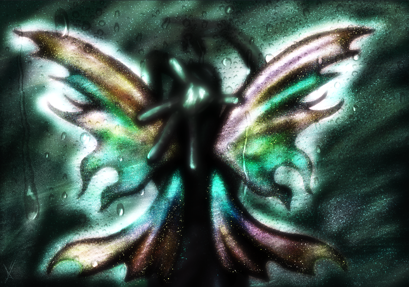
Iridescence Tutorial
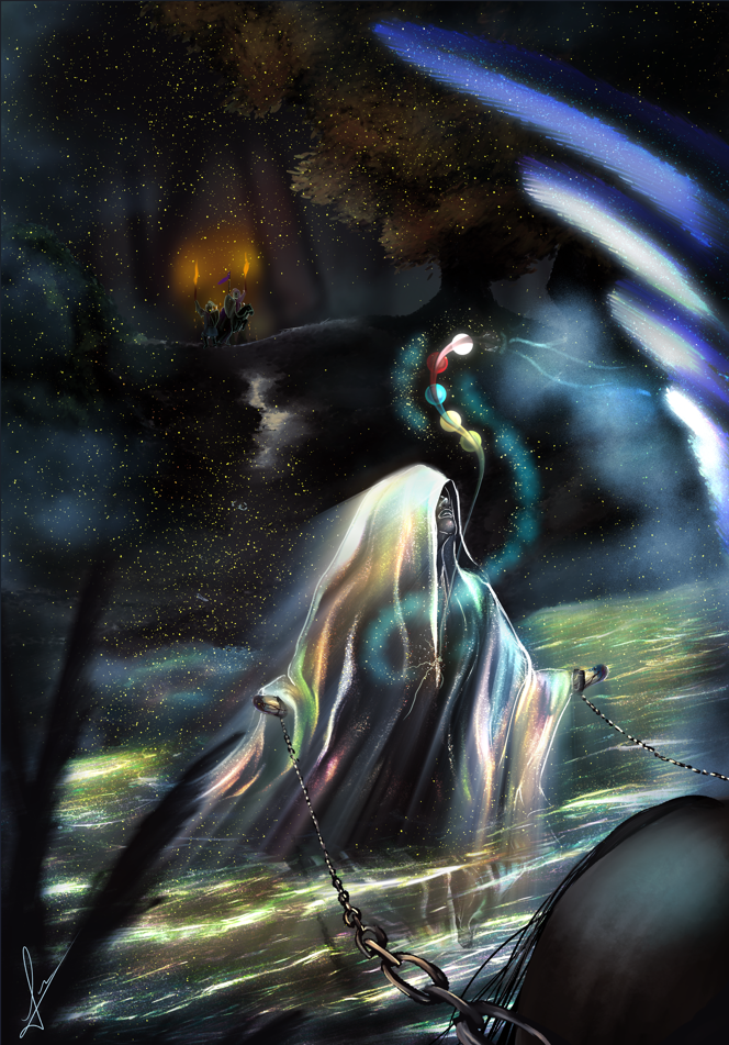
Iridescence is such a magical view. In nature, it can be found in water, rocks, clouds, animals, and more. But painting it can be tricky! This is why I will separate this tutorial into different points:
CLOTH AND WATER - LANDSCAPE
1. We start with the composition and sketch. Whichever the scenario is meant to be, your greatest friend will be a dark background. The pale lines of the sketch will provide light on their own, and the colors will shine stronger. Although originally I drew everything on the same layer, later I separated the background from the main picture. You can start by separating them from the beginning, instead.
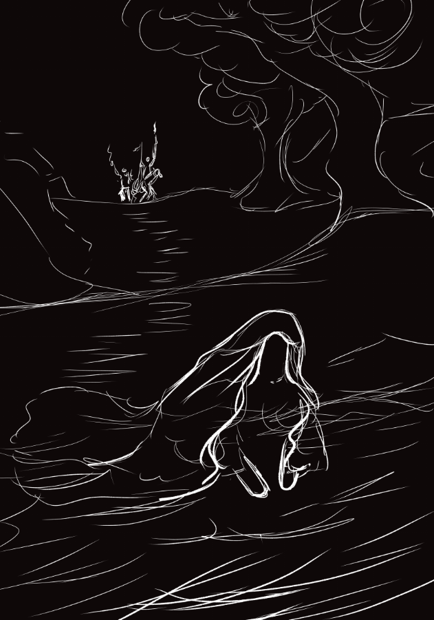
2. The first body meant to be iridescent is the water. I added the waves with a painterly brush and a grayish, dark green. A few brighter lines will start to look like a stream. Don't forget to keep the background color seen-through: the whole painting will follow the same shadow tones.
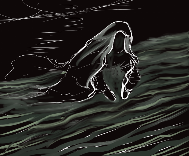
3. On a new layer, I use a pencil (brush) to add pale green lines above. They simulate the foam. This layer will then be converted to "Glow Dodge", and its transparency will vary on how you need the light at that area. Here, it works just fine, at a 100% opacity. However, now the saturation is too high.
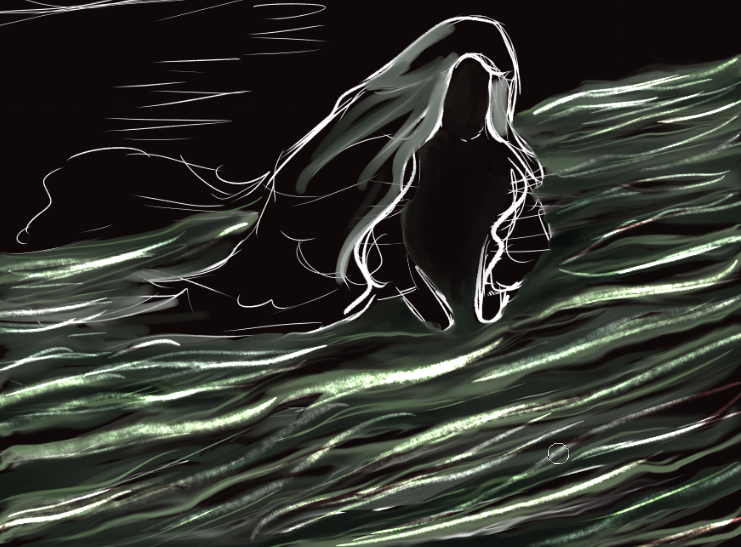
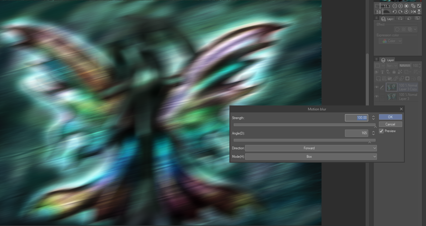
4. Going back to the previous layer, I duplicated it, set it to overlay, and turned it into greyscale. This layer will be motion blurred. The decision came from the need for soft movement. Still below the glow, now the colors are back to dull, and the water seems to be flowing.
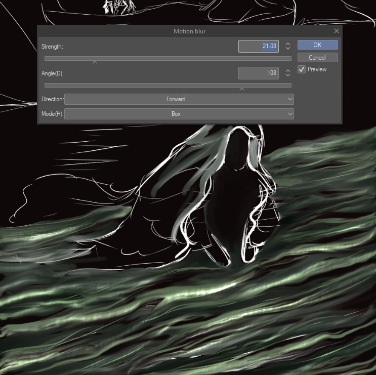
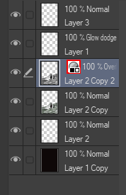
5. On a new layer, on top, adding small white/yellow (doesn't matter) lines will create a more detailed, dynamic view. I keep them messy, for they will become another "glow dodge" layer. Barely below 80% on opacity, there's now texture. To help a little more, I used a sharp blending brush to make circles around the character, as well as caressing some of the new lines, to make them softer.
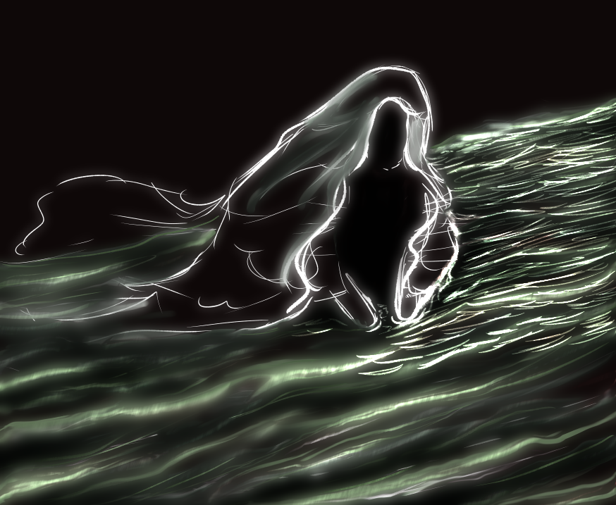
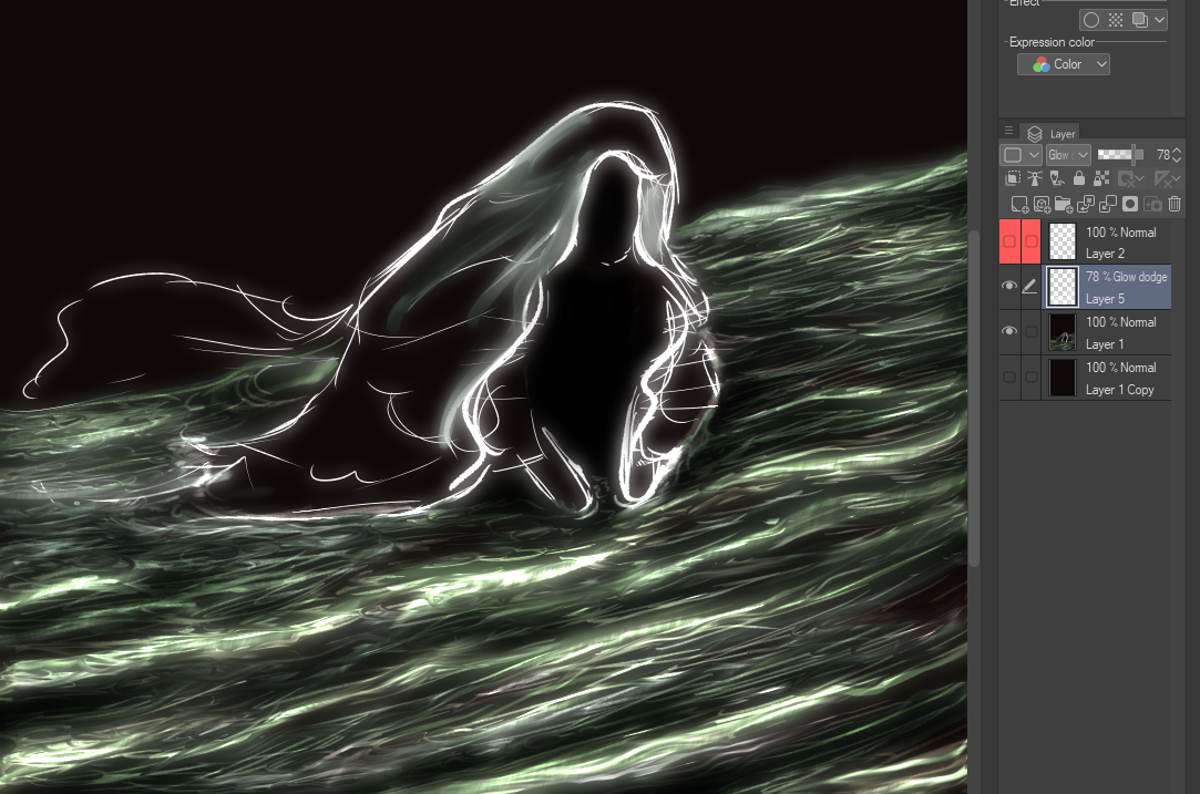
6. On yet another layer, I spread the colors, following the waves. Yellow will lead the rest but blue will make a strong difference. This layer will be transformed into "Overlay", and set at around 60% opacity. At this very moment, you could decide to leave it as it is, but, I will continue making it more ethereal.
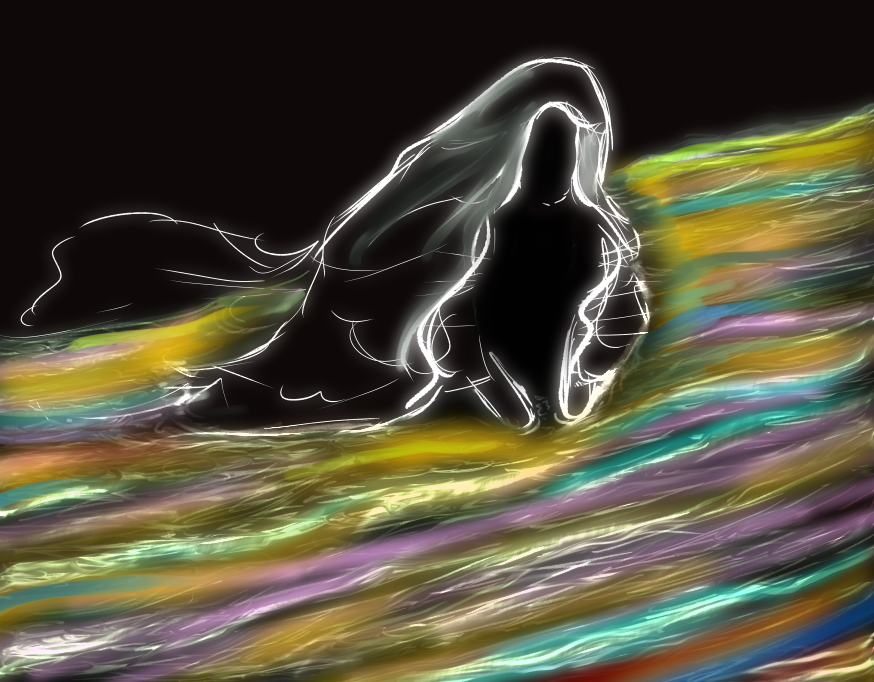
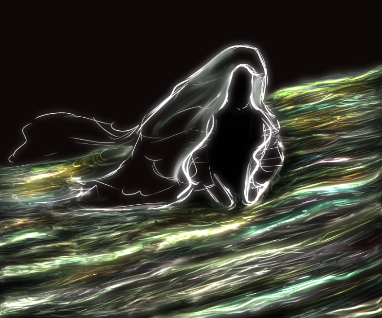
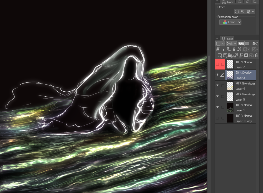
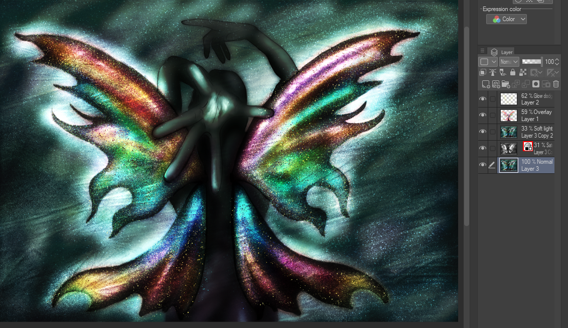
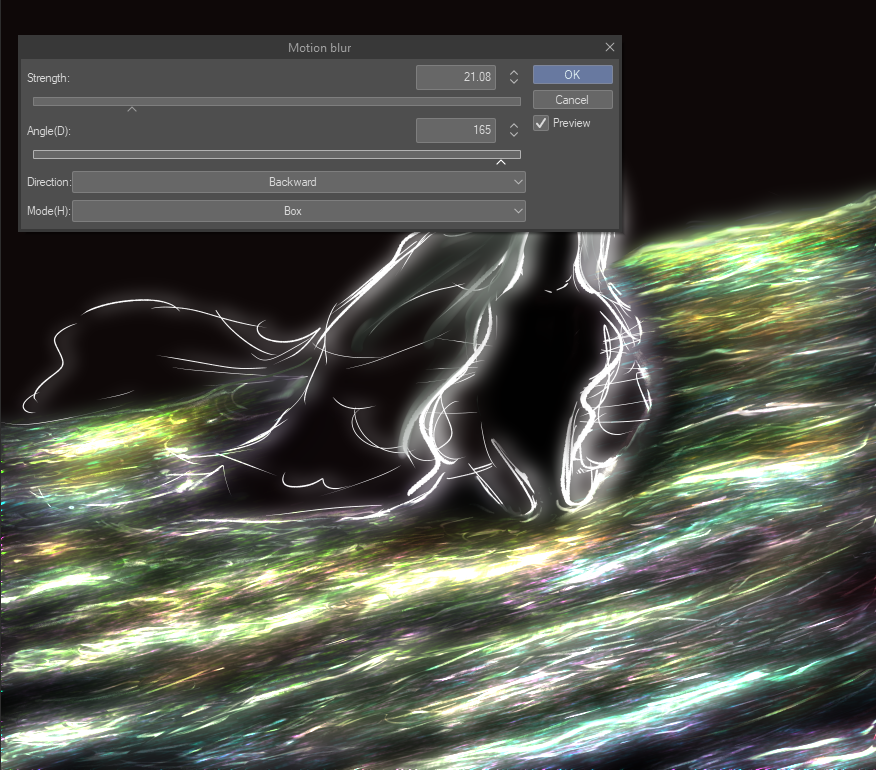
7. On a new layer (again), I sprinkled the water with a large amount of dots, using the spray brush. Pink, green, blue and orange, very saturated, and following the waves. The result covers most of surface. Transform the layer to overlay (although at the beginning I did to glow, shown in the screenshot, you may test both, to see what works in your piece), and add motion blur. At this very moment, the results have escalated into a more magical view, but right now, the water takes protagonism, so I tone it down by lowering the opacity of this layer.
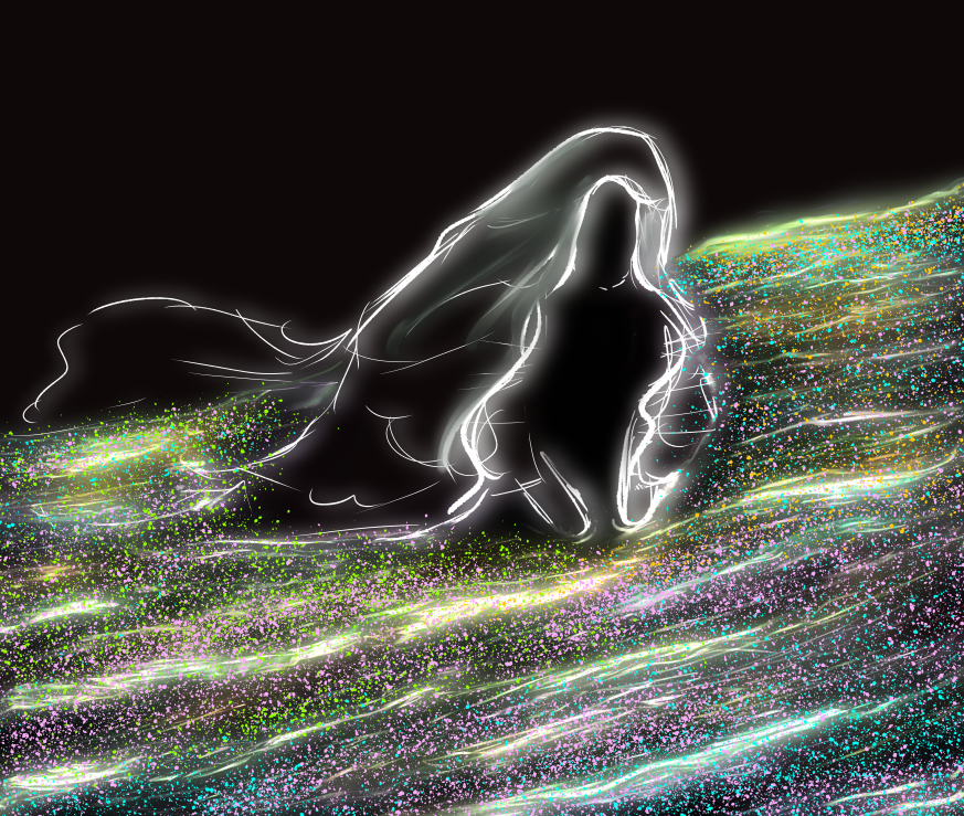
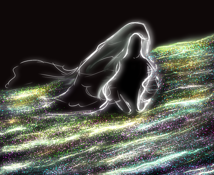
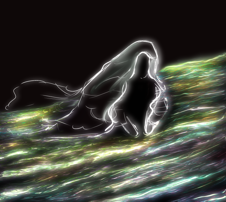
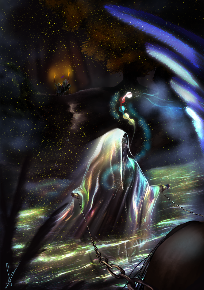
8. Time to work on the main character of the scene, in this case, Empress Viaret. Upon further sketching, I decided to change the pose, and I found a reference good enough to lead the idea.
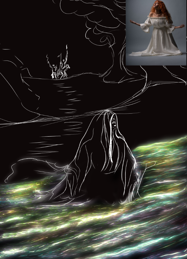
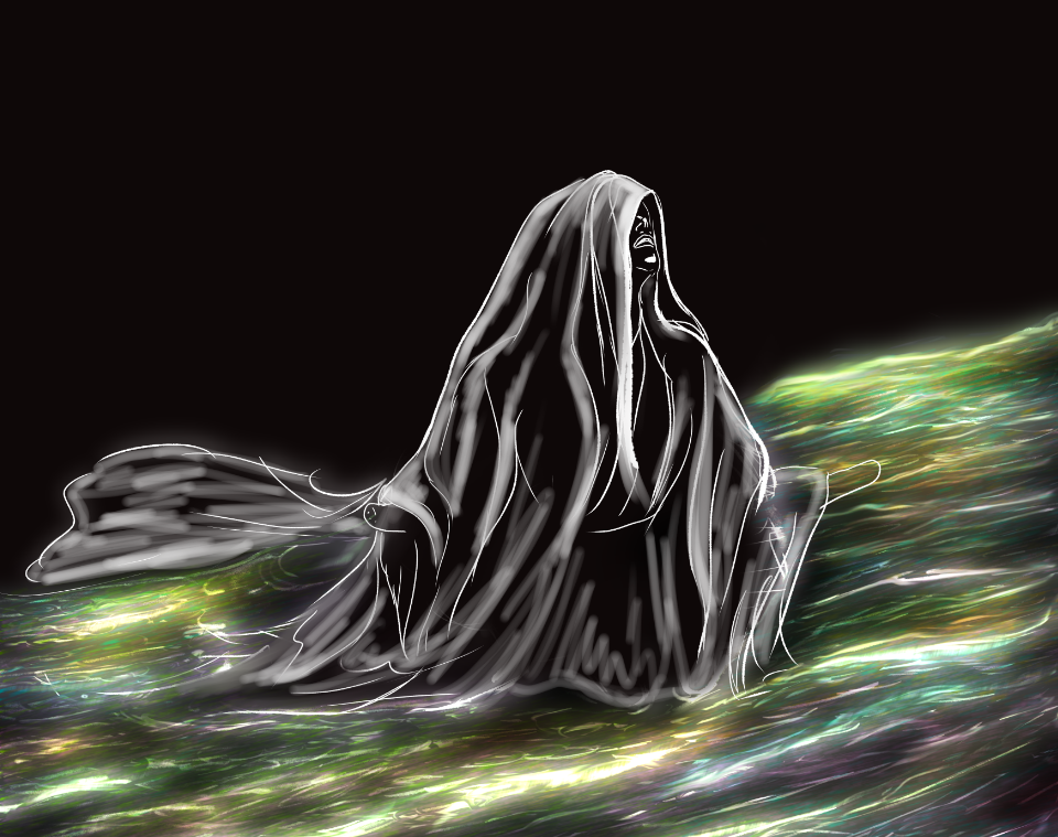
9. I continue working on the sketch layer. The cloth texture remarks the folds where the light shines, while the background keeps the shadows strong. For the pale strokes, I used a painterly brush, again. All of them got blended with a rough brush, to finish the texture. The head remains as the most lightened part, here.
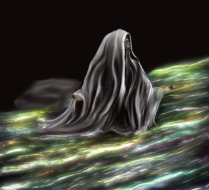
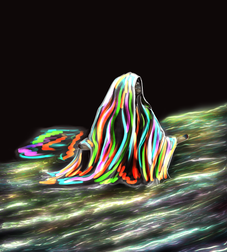
10. On a new layer, and, equally to the waves, I added several colorful stripes, from head towards the water. Once gaussian blurred, it seems like "Add Glow" is the perfect fit for the layer.
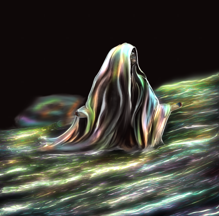
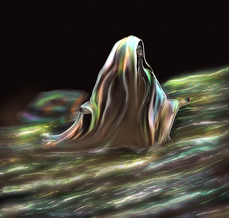
11. With the airbrush and a new layer, I painted the darkest area in brown. Dress and water alike. This layer is set to "Color Burn", and opacity at 30%.
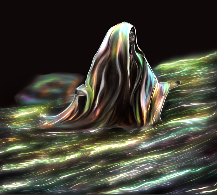
12. Repeating the spray process, on a new layer, I covered the colored surfaces in yellow dots, and set it to "Glow Dodge". Then, I lowered the opacity to 70%.
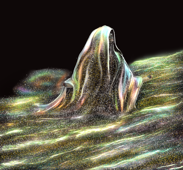
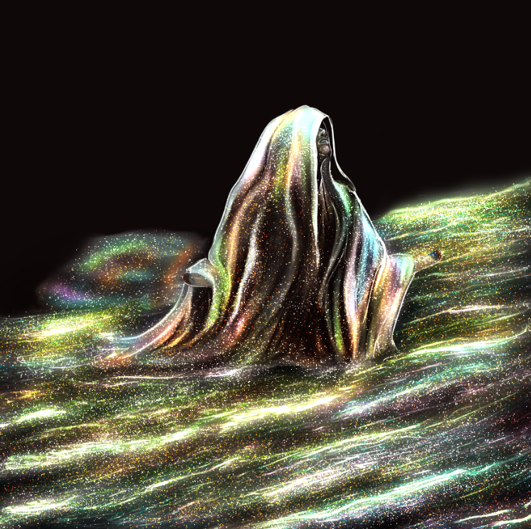
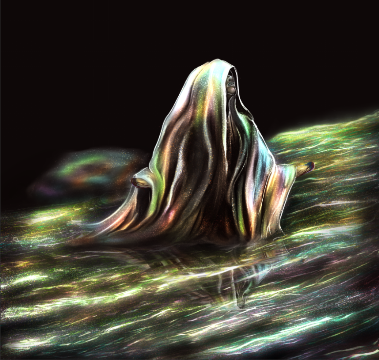
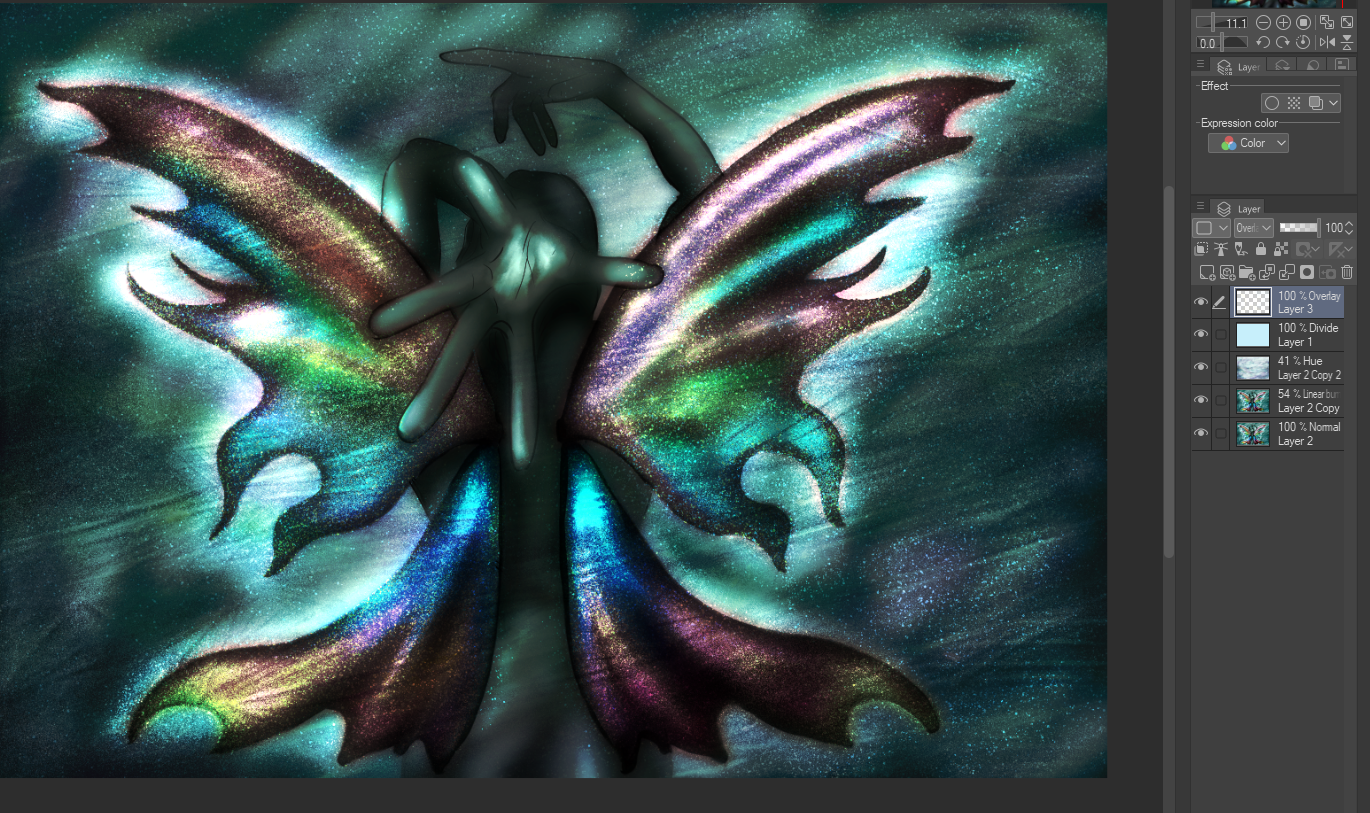
13. To finish the main scene, I merged all the layers, including background, duplicated the result, then added radial blur to the copy, and transformed it into "Add Glow".
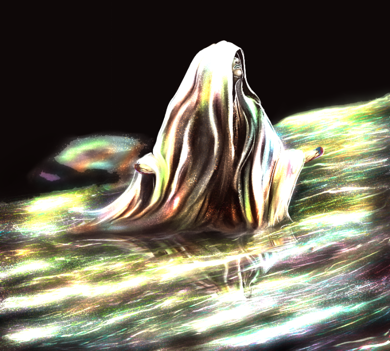
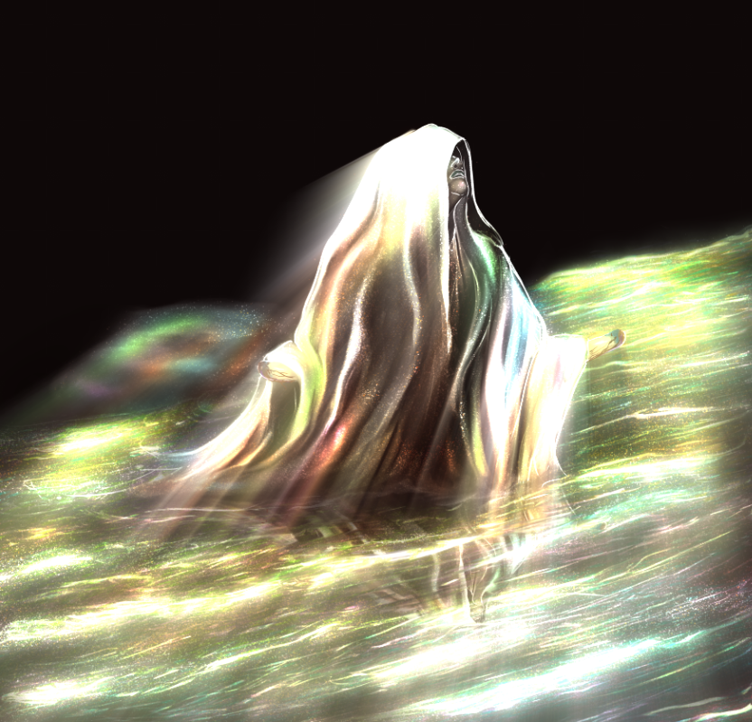
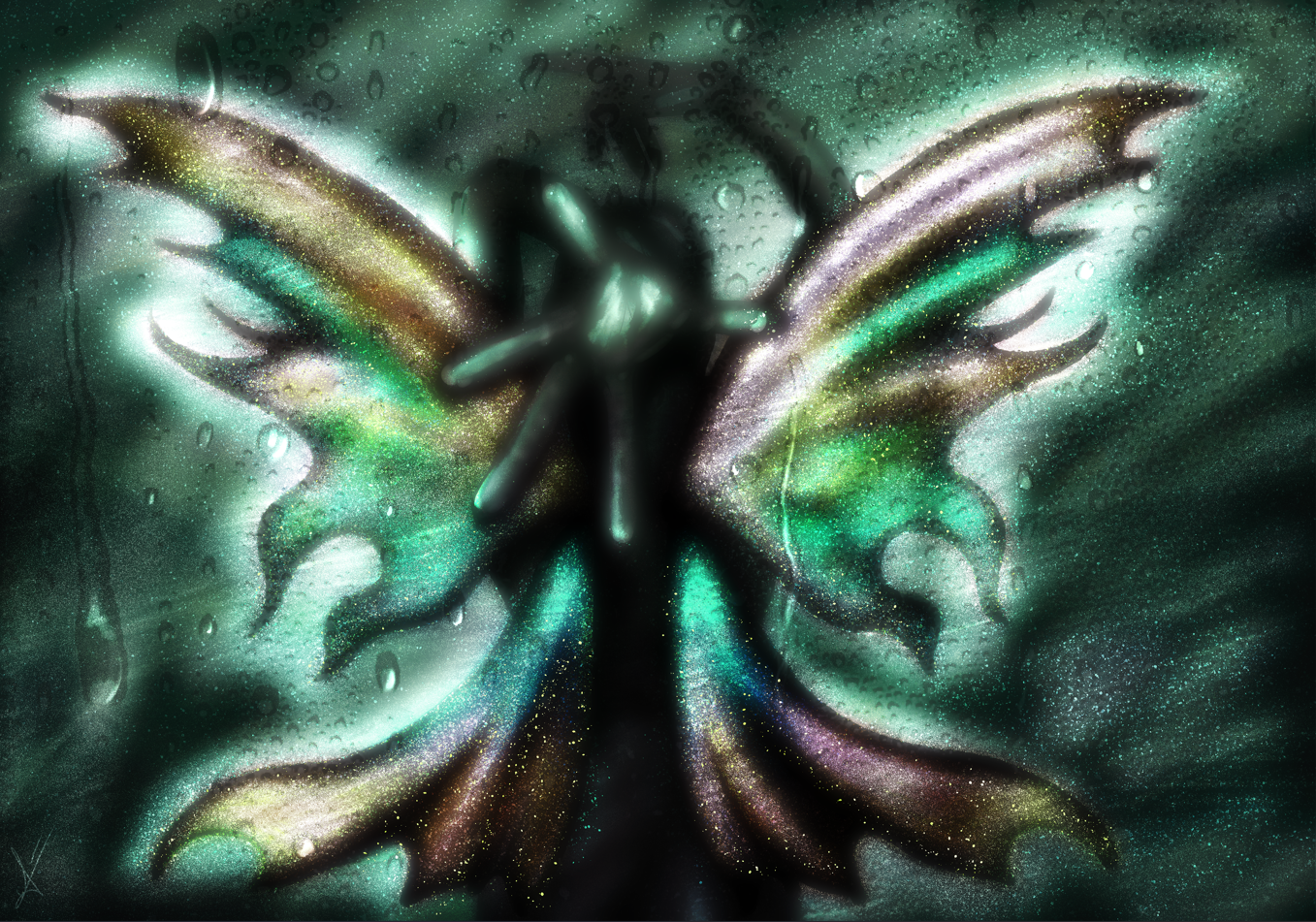
14. Time to work on foreground and background, and add the final touches. In my case, an extra layer on top of the rest served as the lighting color, achieved via blue on "Hue" setting, lowering opacity and erasing where the colors drowned.
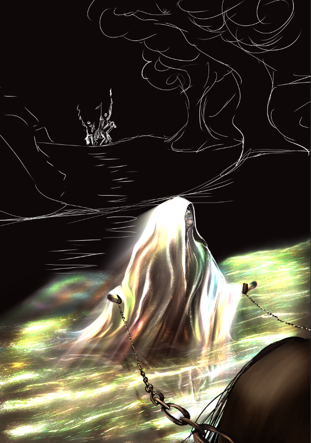
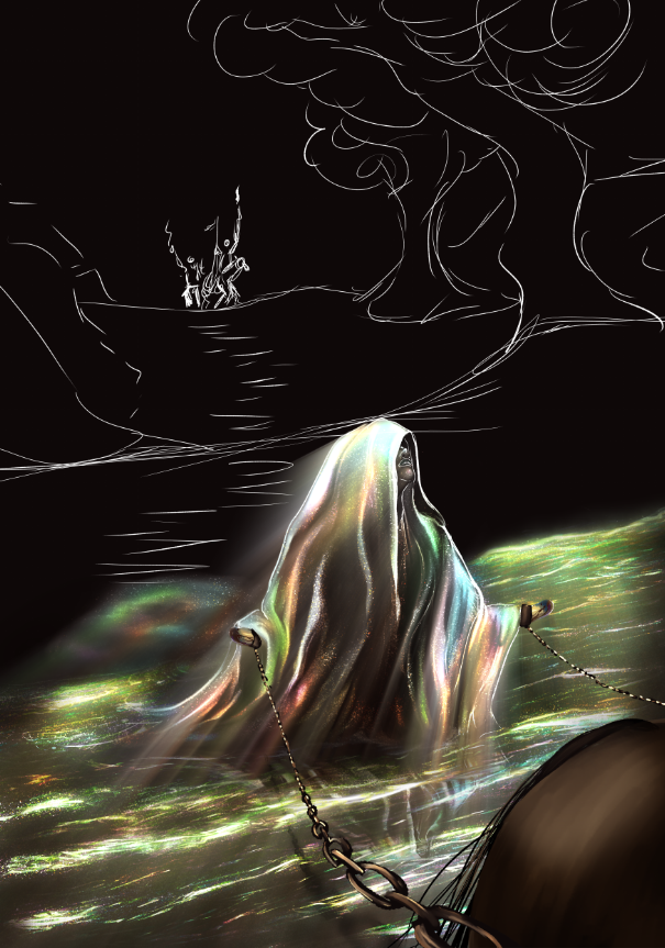
Results:
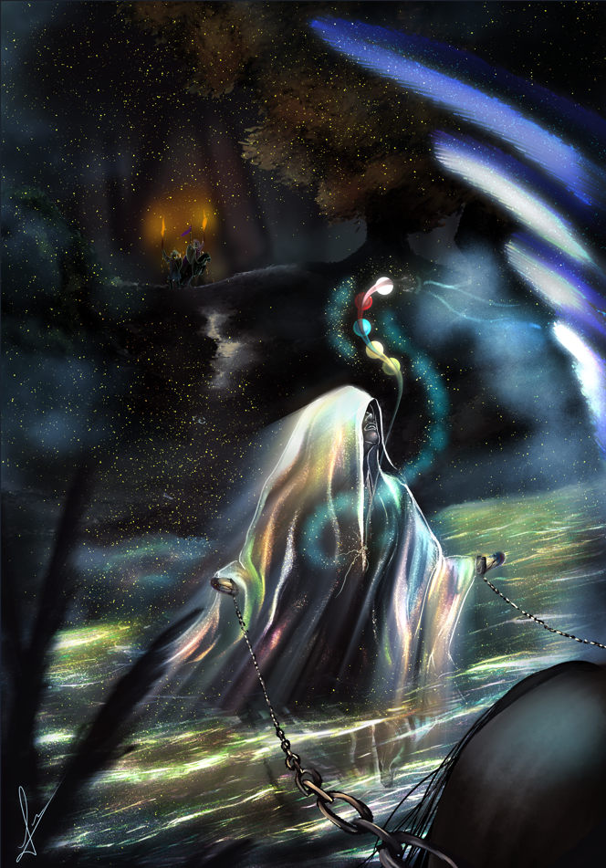
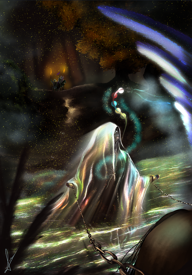
EYES AND SKIN
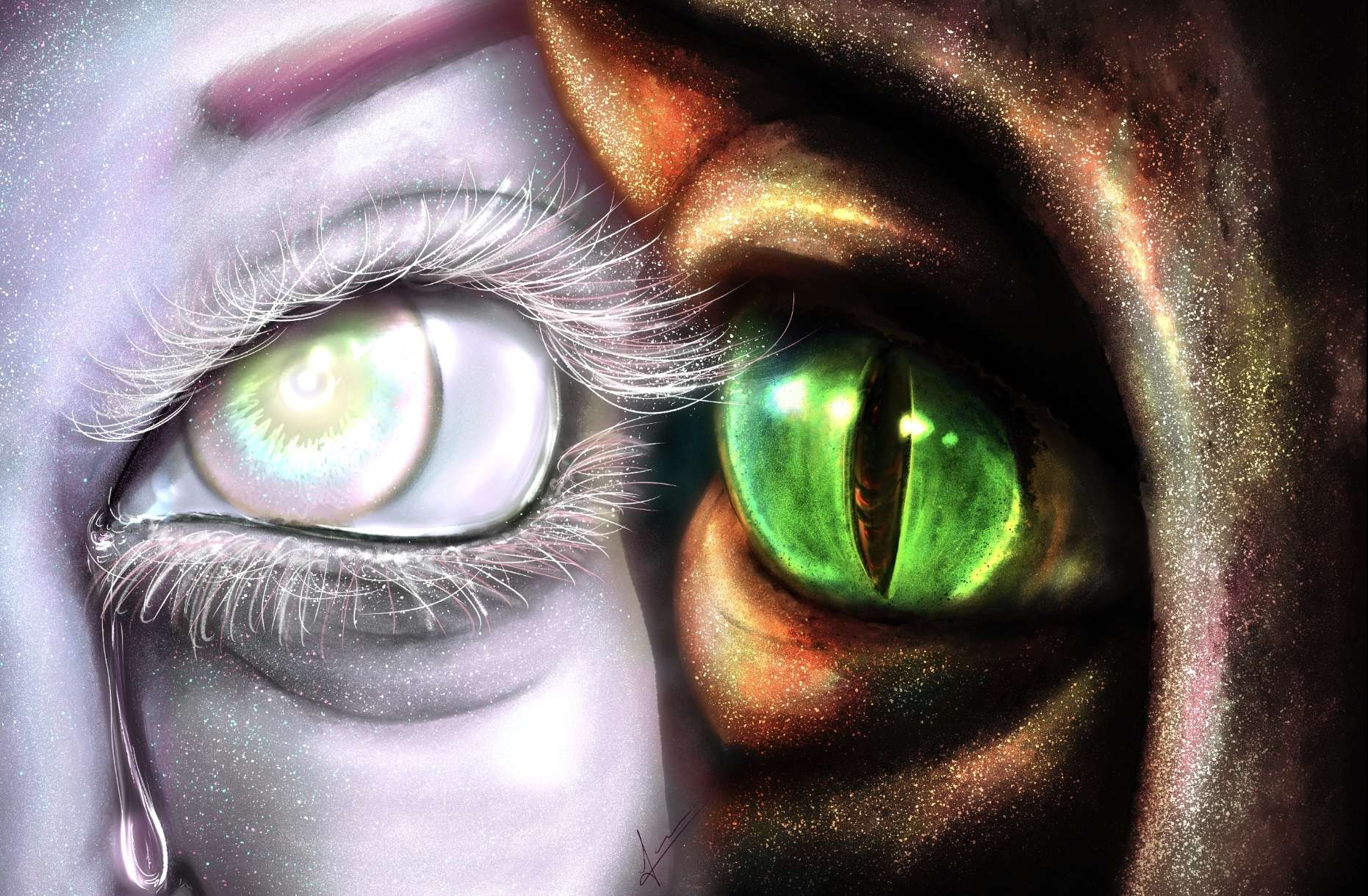
On other surfaces, it works similarly. Here's another example.
1. Prepare the base and colors. Remember, keep it dark to begin with!
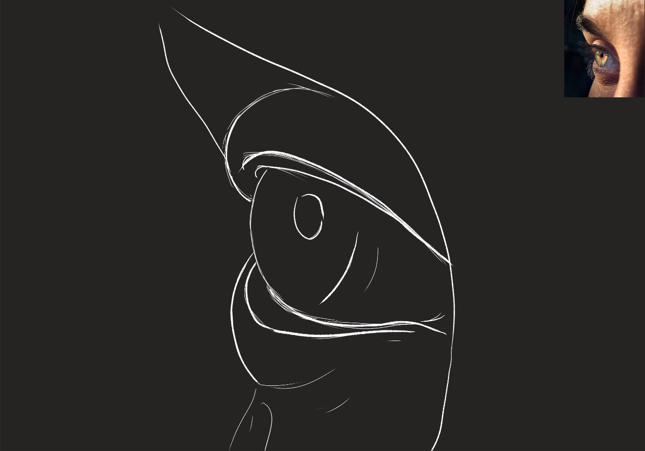
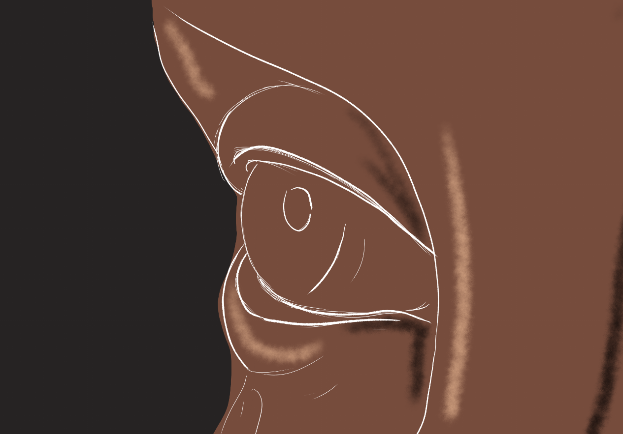
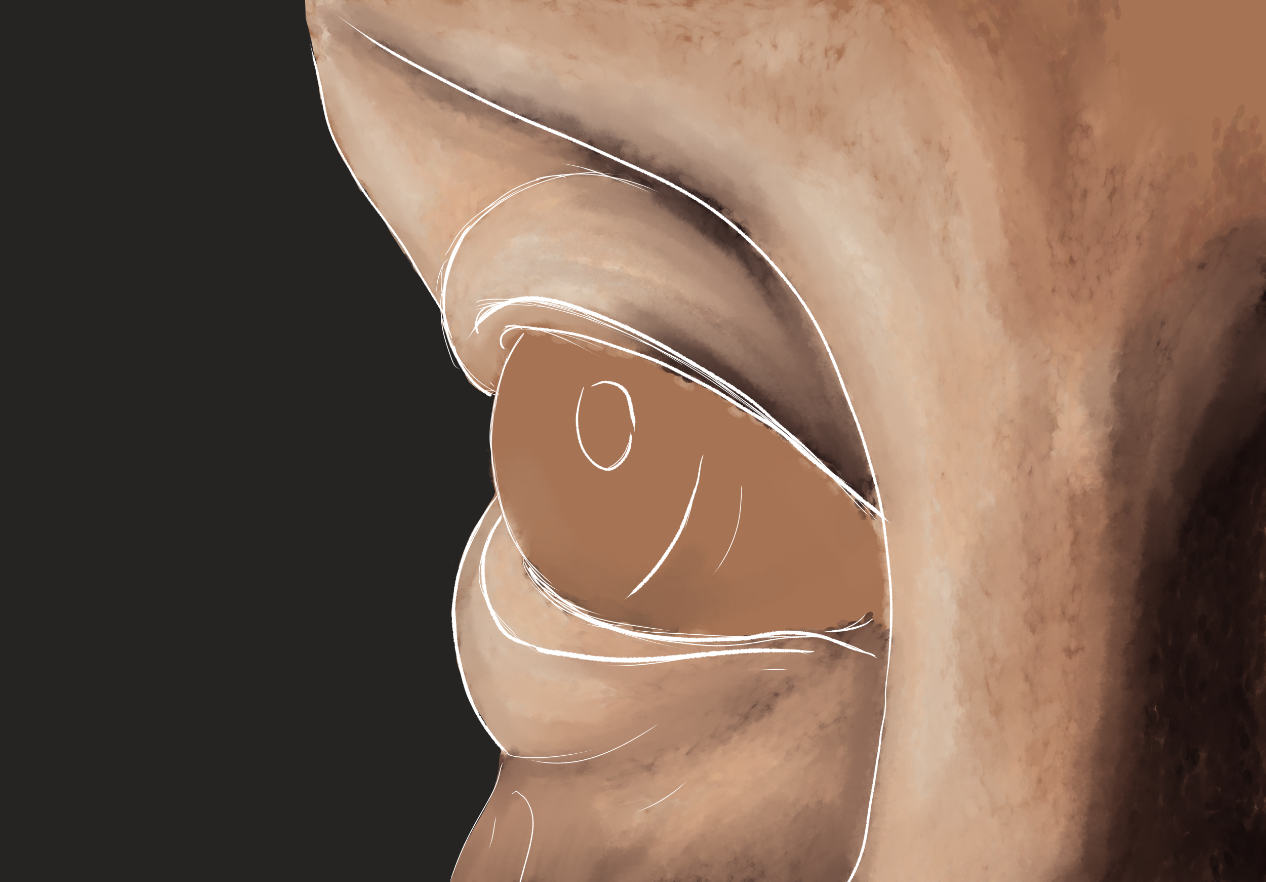
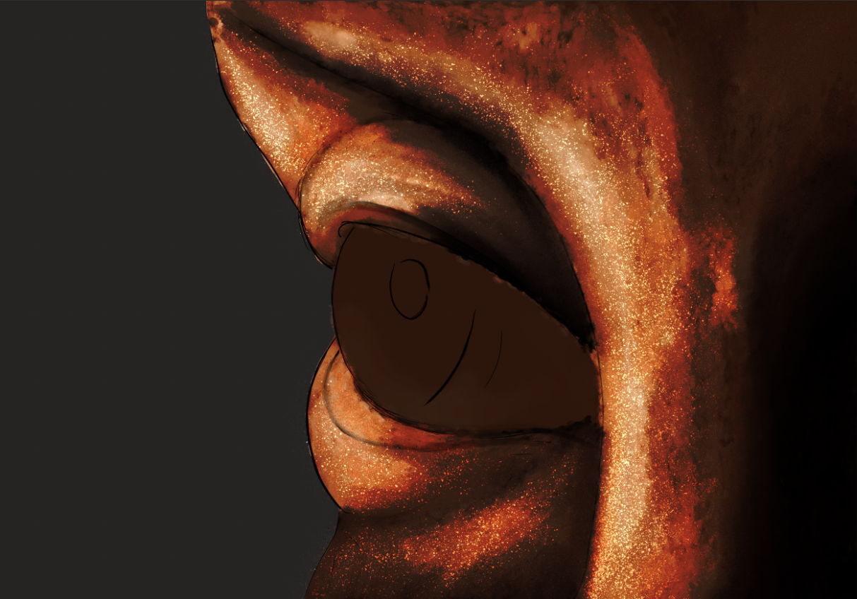
2. Eyeballs are usually bright, so, let's add the shading as we would for a sphere. Here, I use yellow as background.
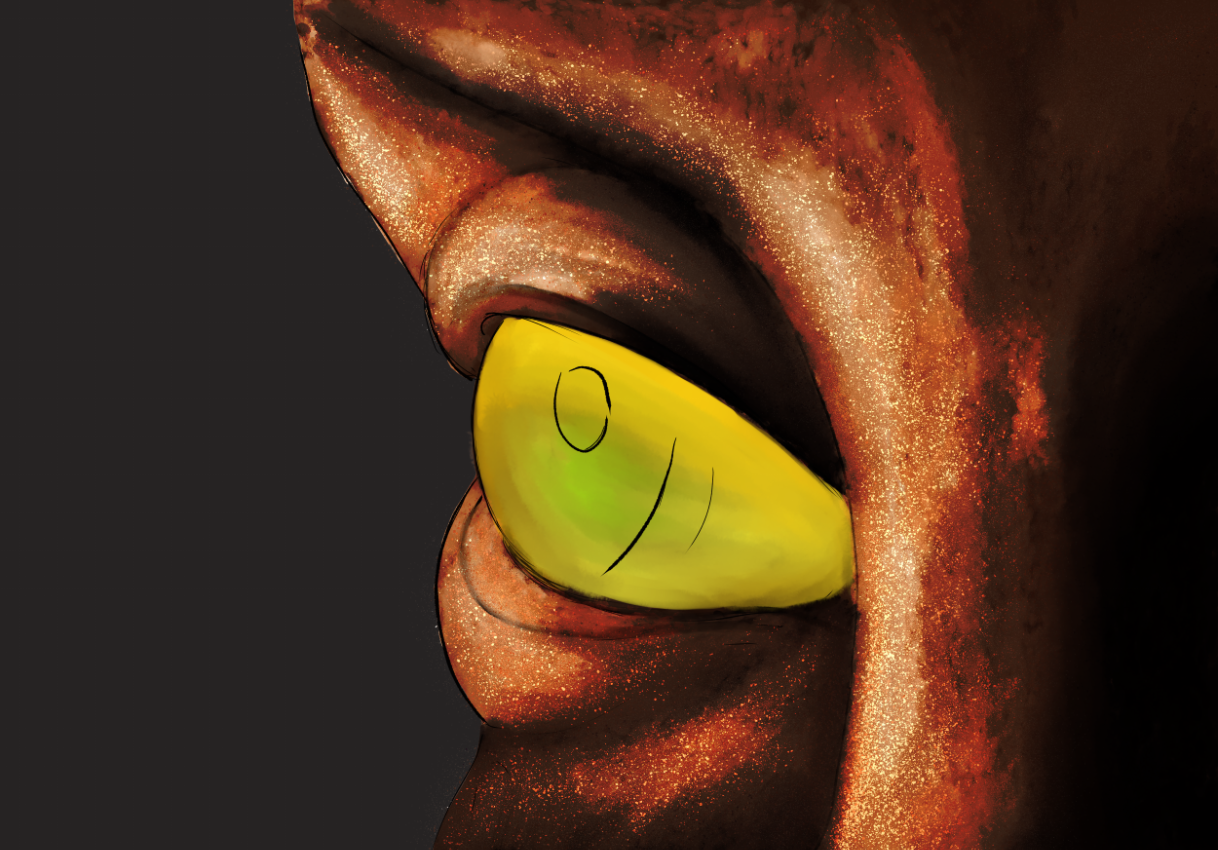
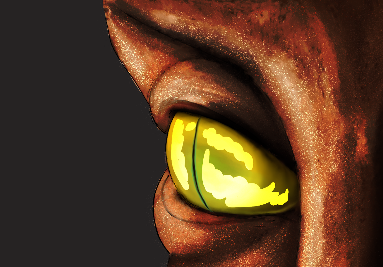
3. To make it darker, again, I added green, allowing the yellow to shine closer to the pupil.
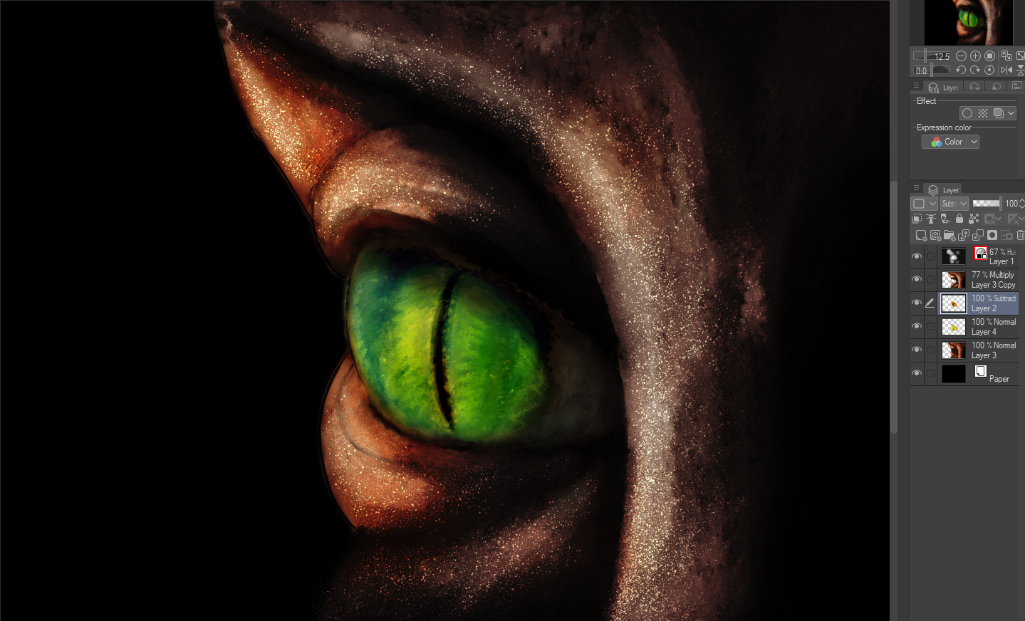
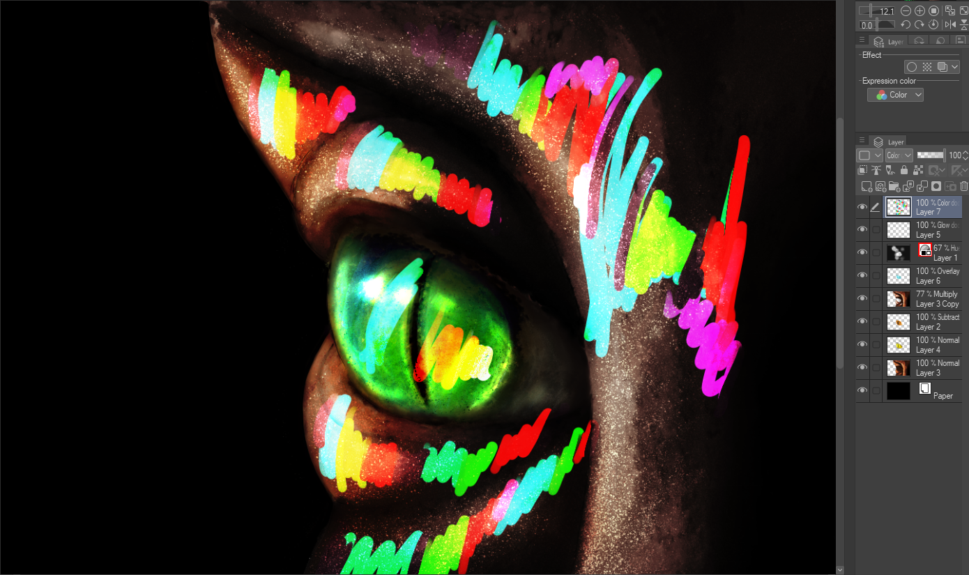
4. Time for the iridescence, I splashed some lively colors all the way! The layer will be transformed into either Glow dodge or Color Dodge. These colors will be smudged, until no strong edges are left.
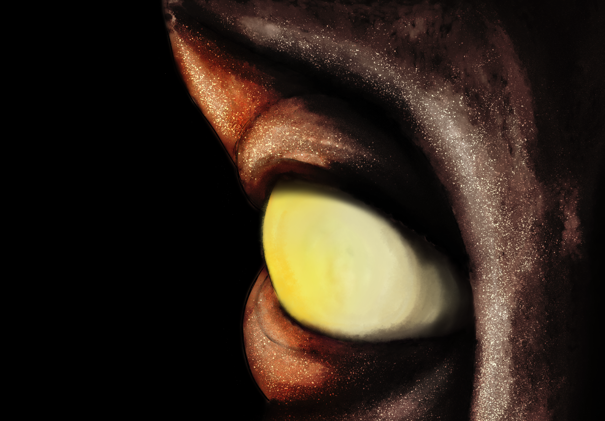
5. Let's try this on a brighter tone! I drew a paler face next to the dark one.
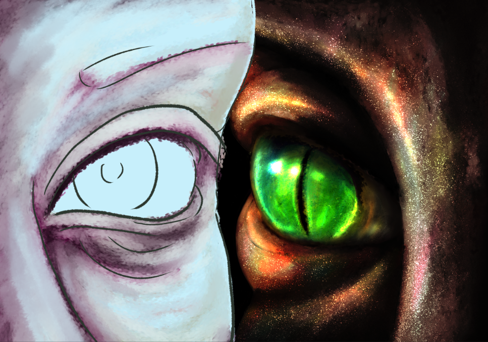
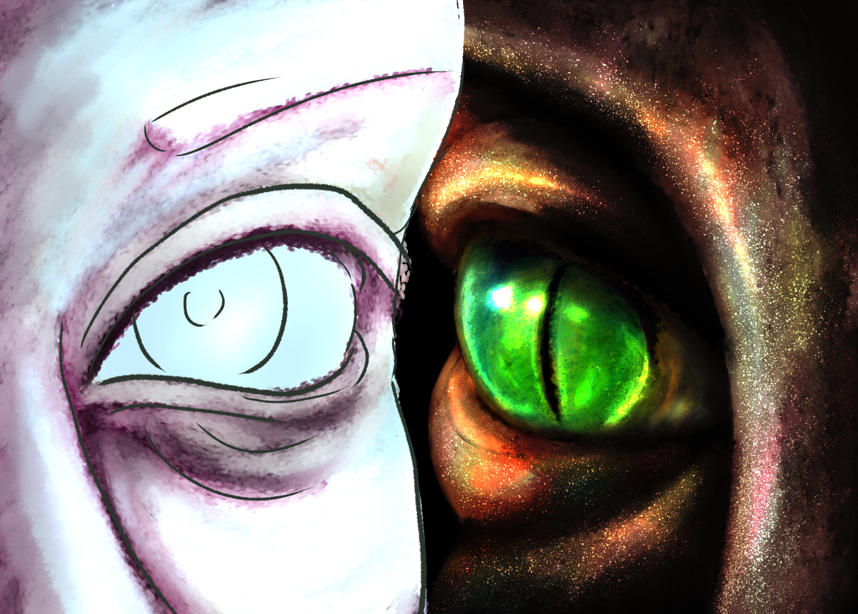
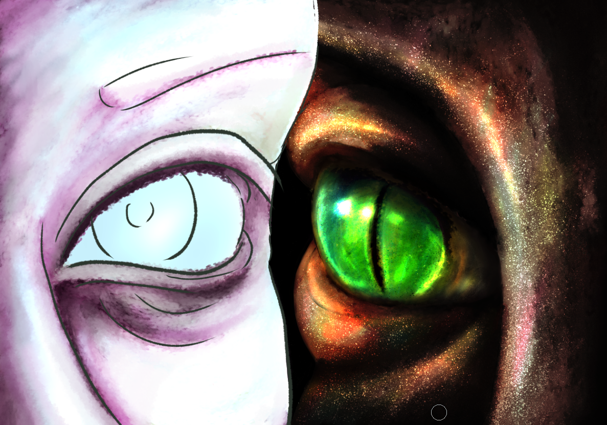
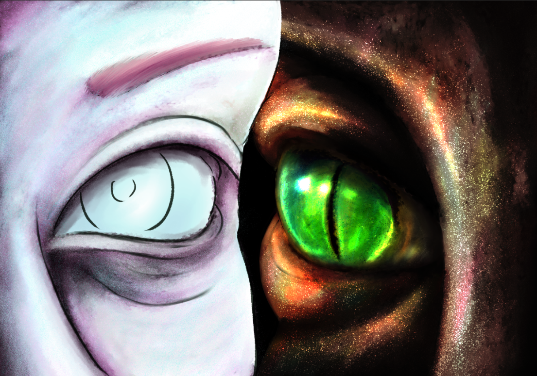
6. Repeat the previous steps, adjusting the colors at will, and adding the necessary Glow layers. The efect of iridescence will be less noticeable, but more ethereal, overall.
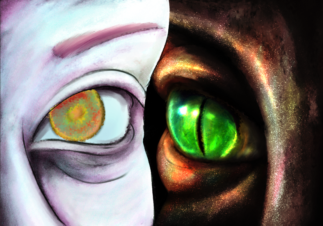
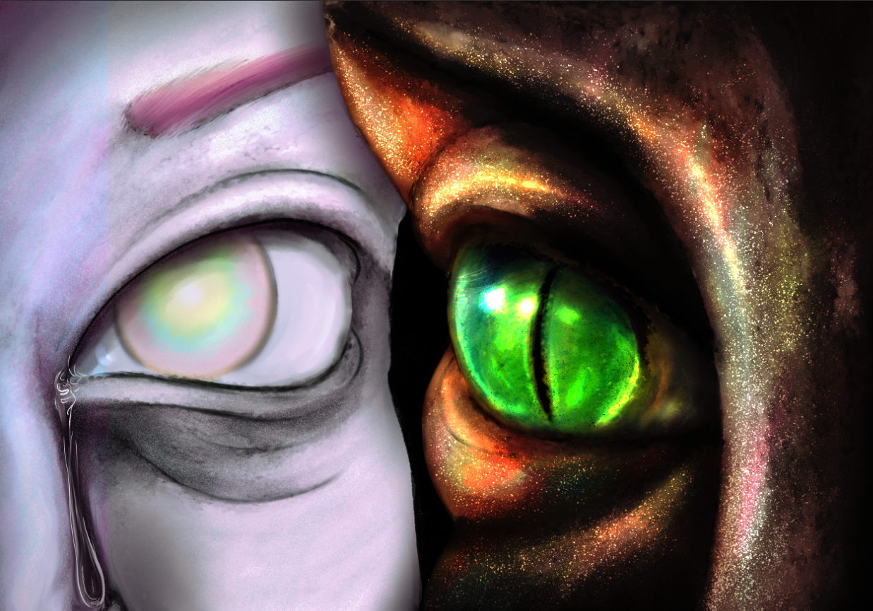
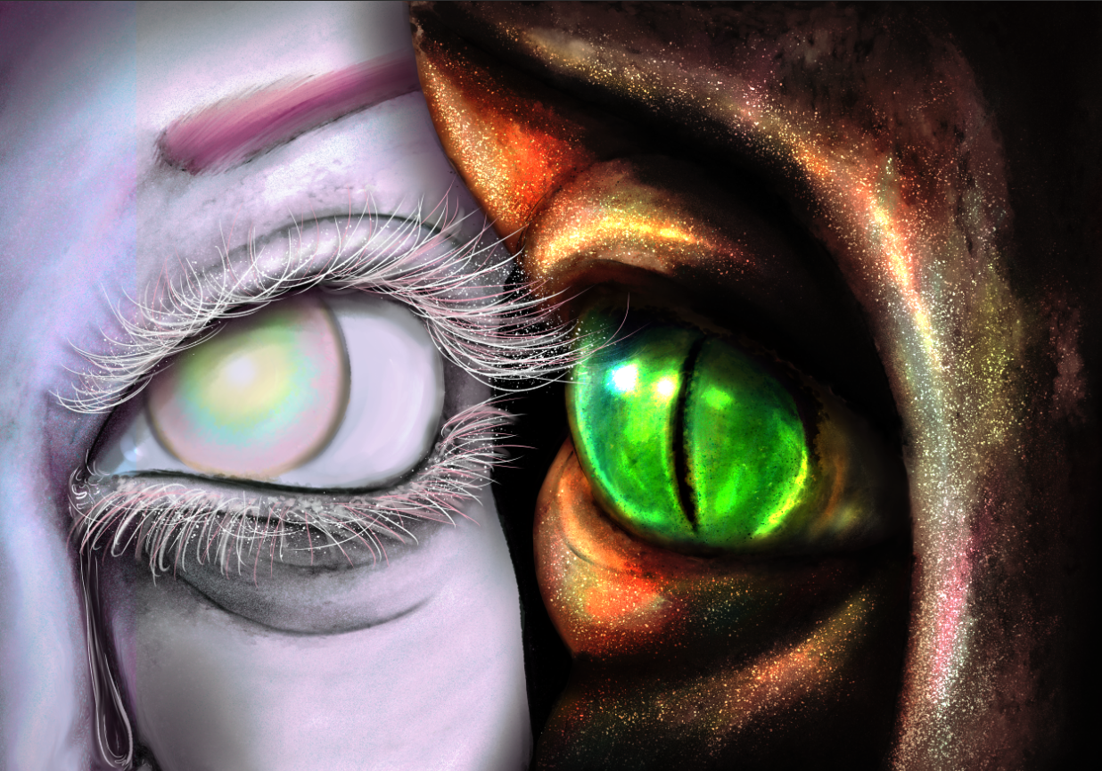
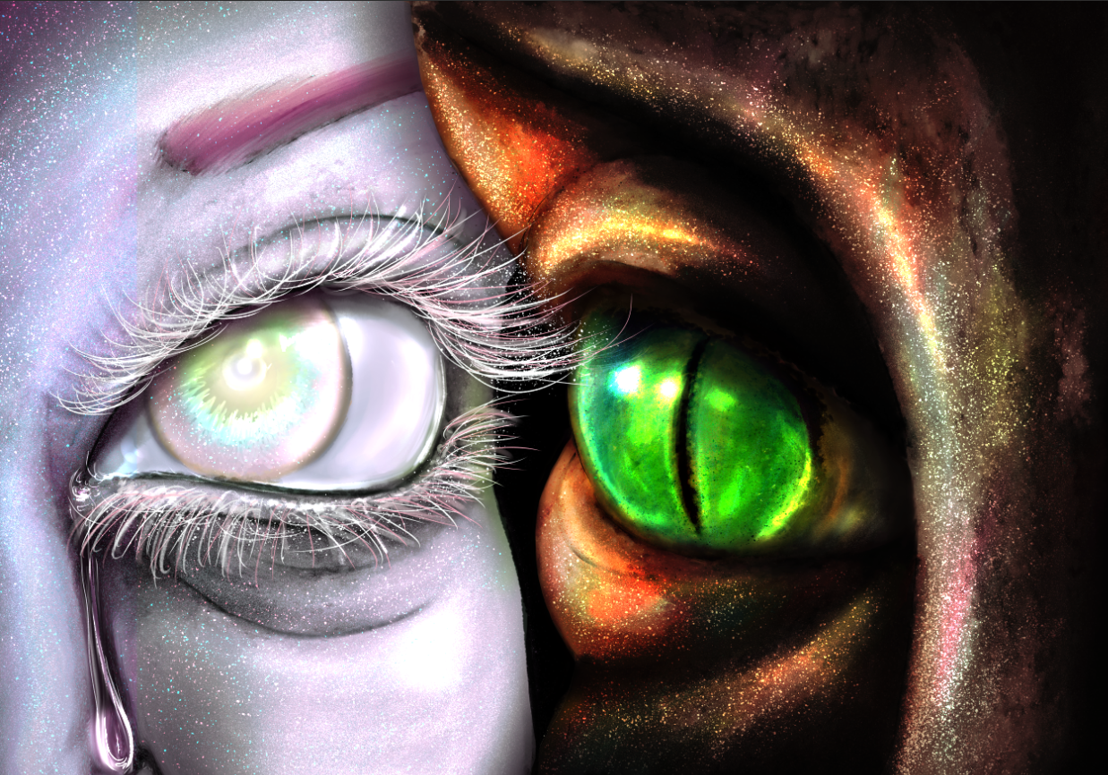
Results:
ICE AND SNOW
Majoritarily, ice is painted gray, white or blue. But, to make it more interesting, sunlight can, sometimes, add a ton of colors! Winter is more colorful than one expects.
1. This background will, again, be dark, in a shade of blue. I added some pale lines, and played with the contrast and hue.

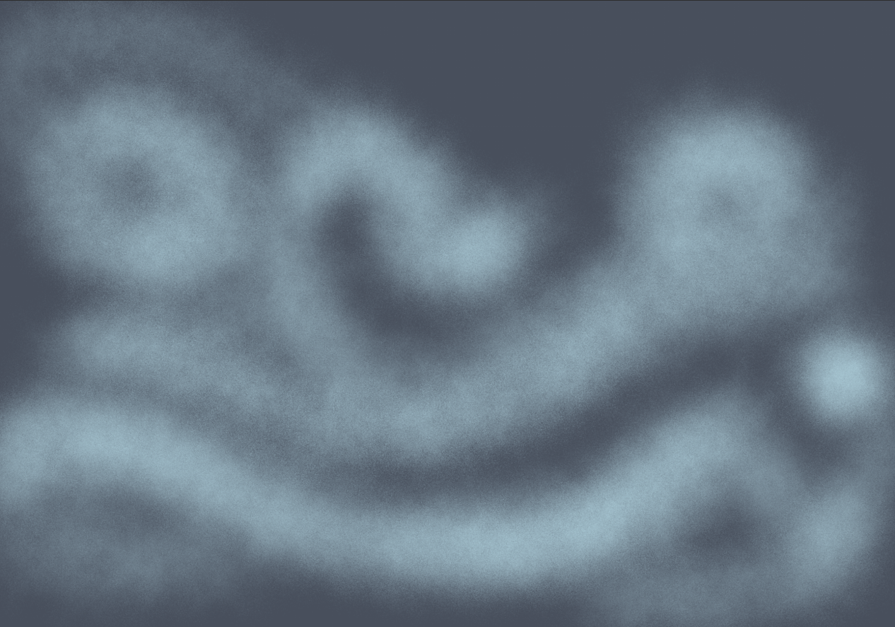
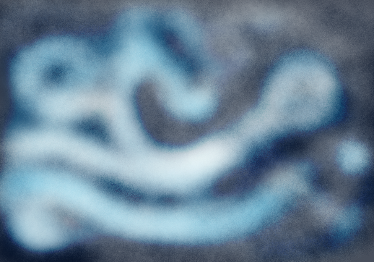
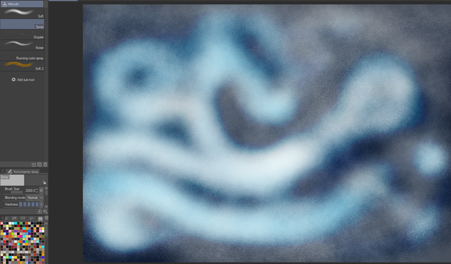
2. Right away, I added the color, with the Glow layers, and smudged.
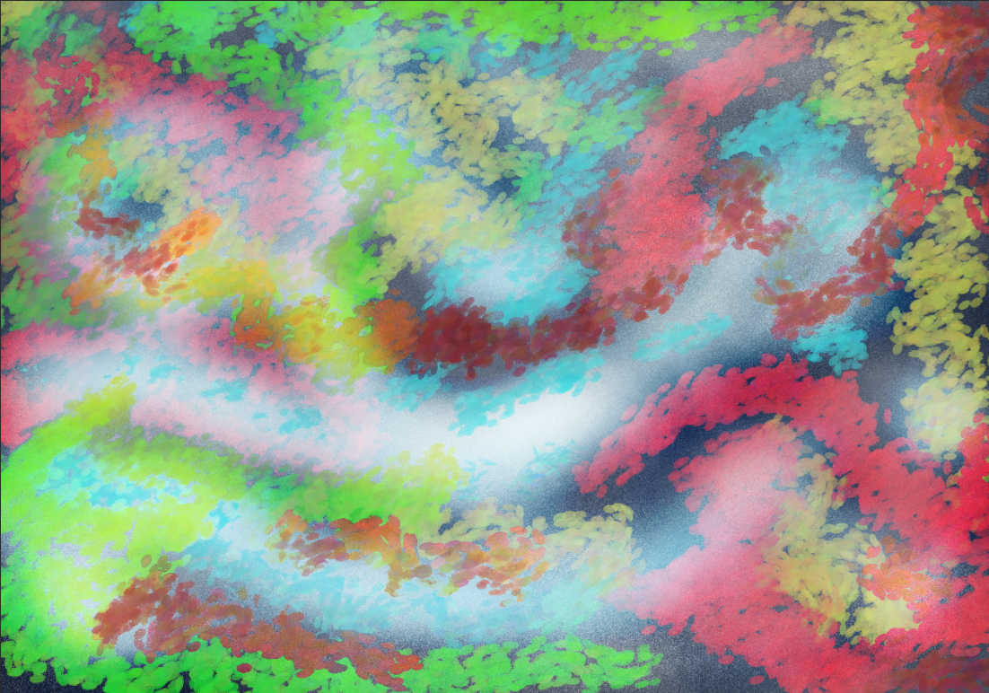
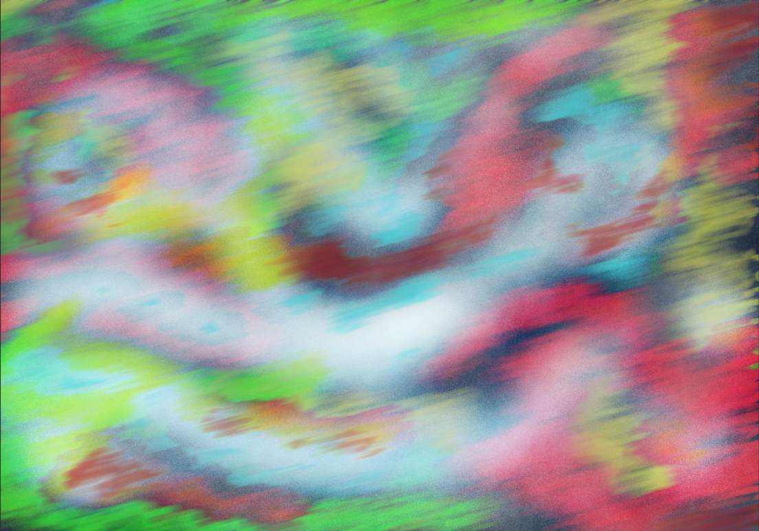
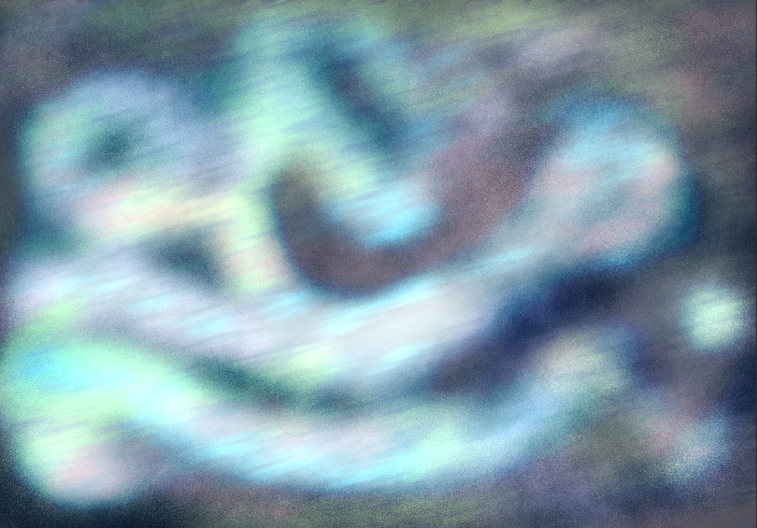
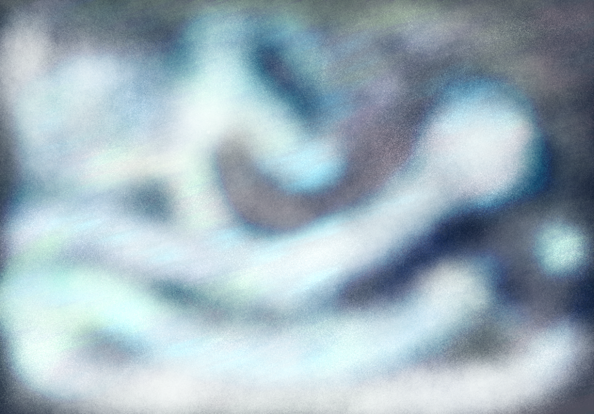
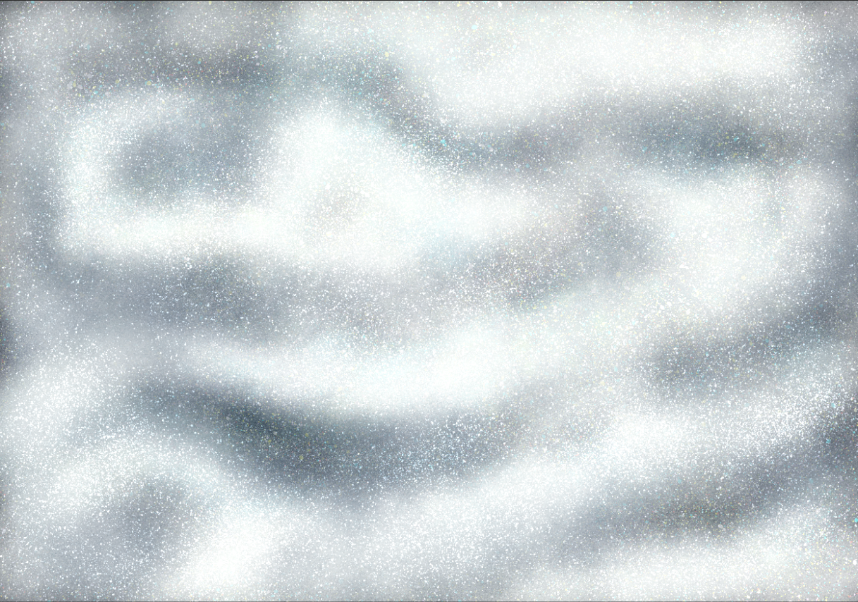
3. Making use of the spray brush, I covered the surface with dots. They ended up white, and simulating snow. With this, one could leave the picture as finished.
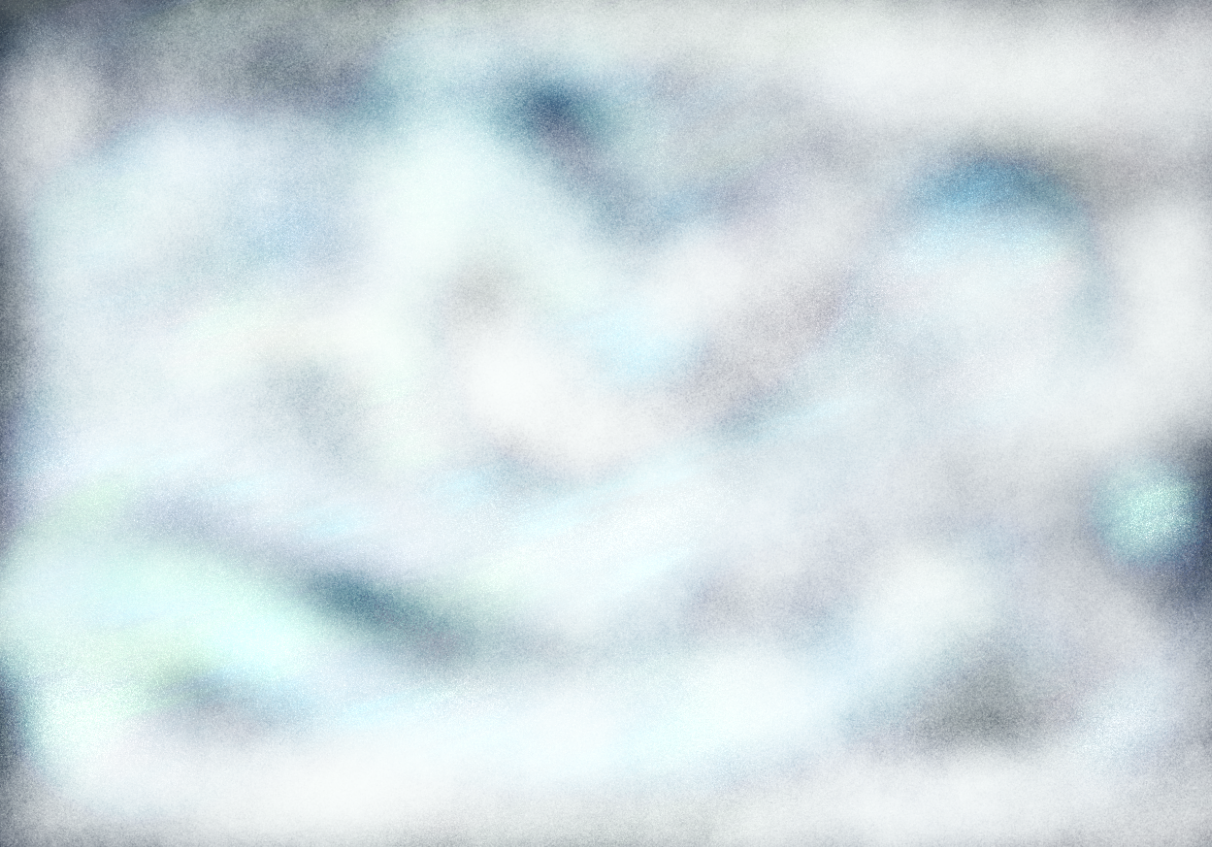
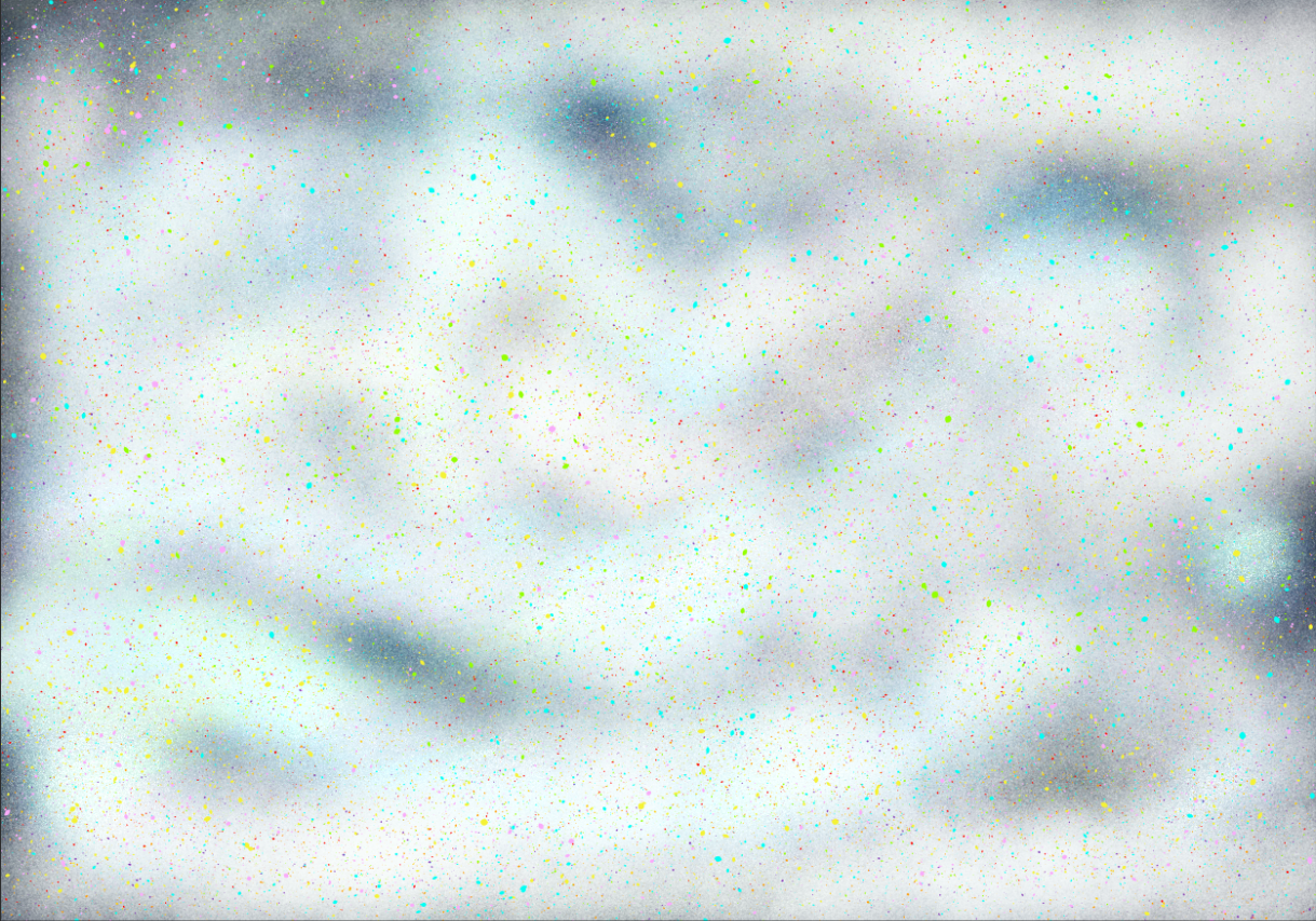
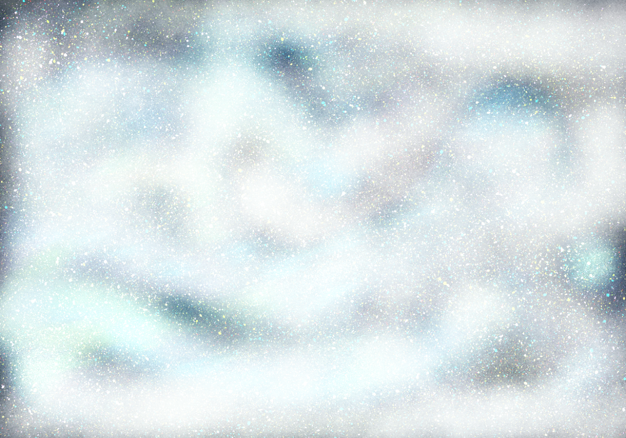
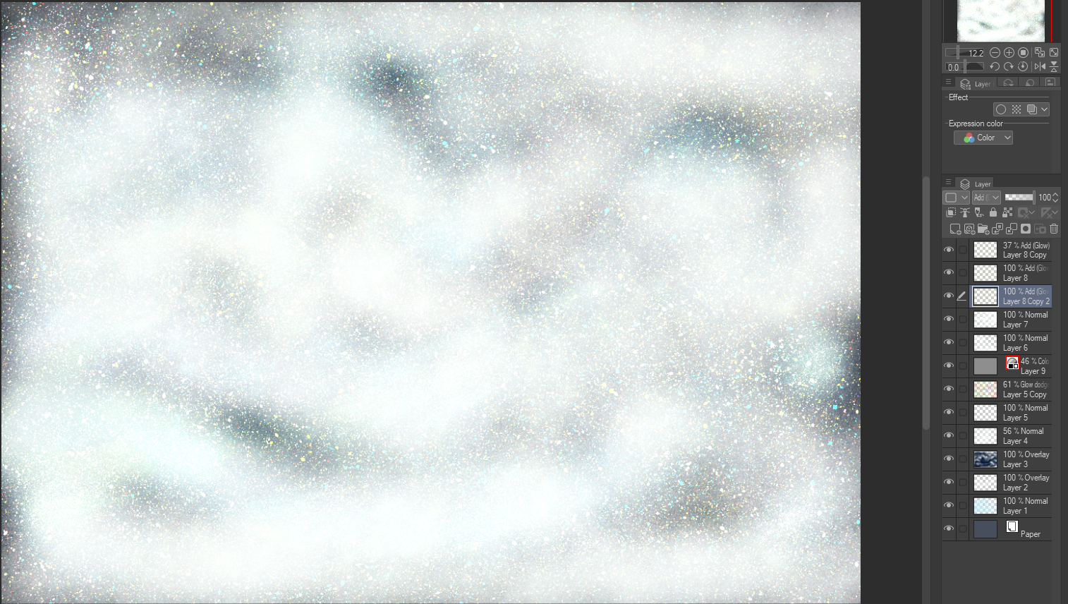
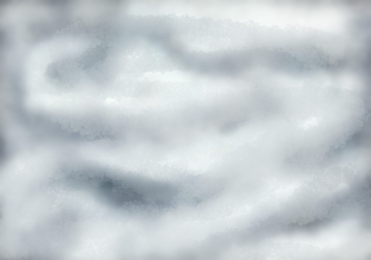
4. But, I continued, by adding some shade and hair-like lines. Copying the layer and turning it into both Difference and Glow Dodge, these lines ended up looking like scratches on ice.
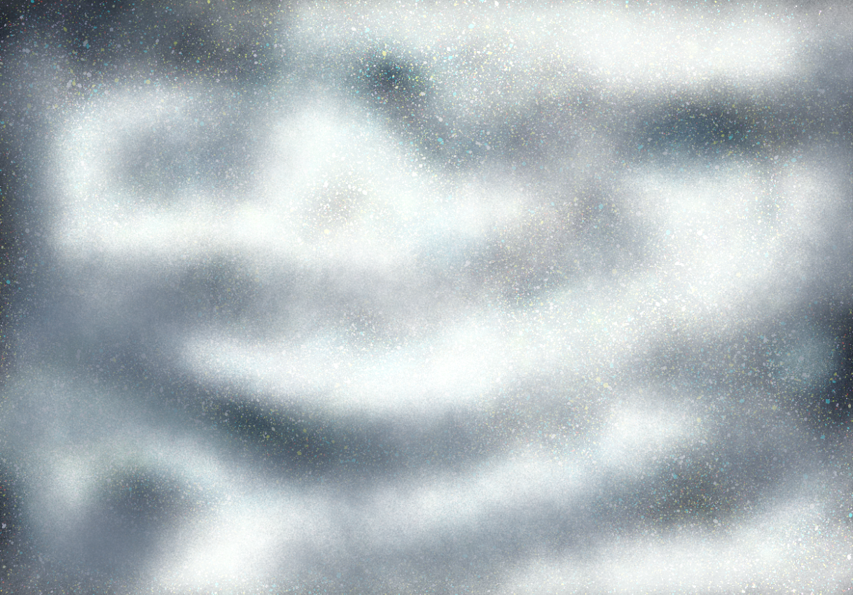
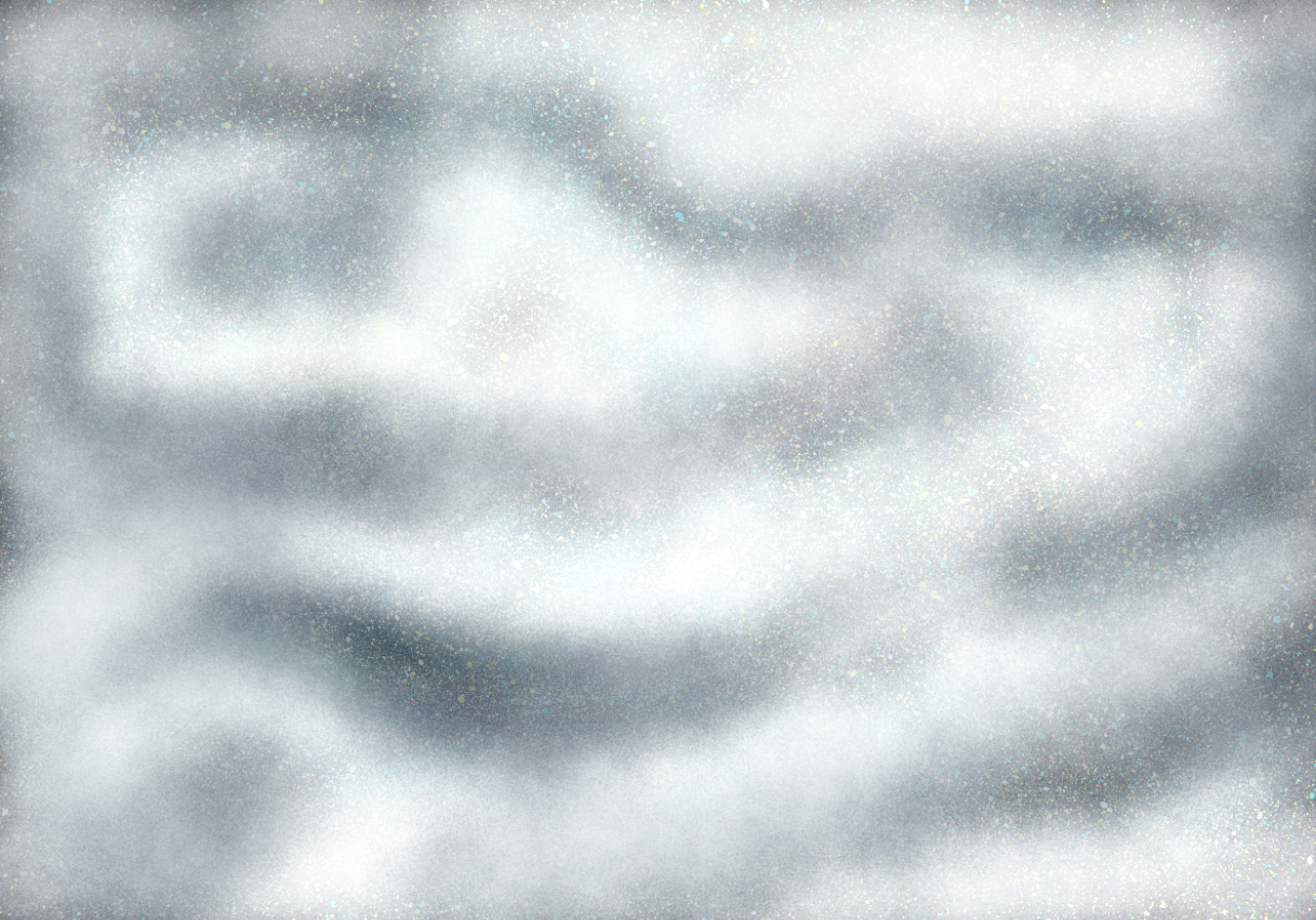
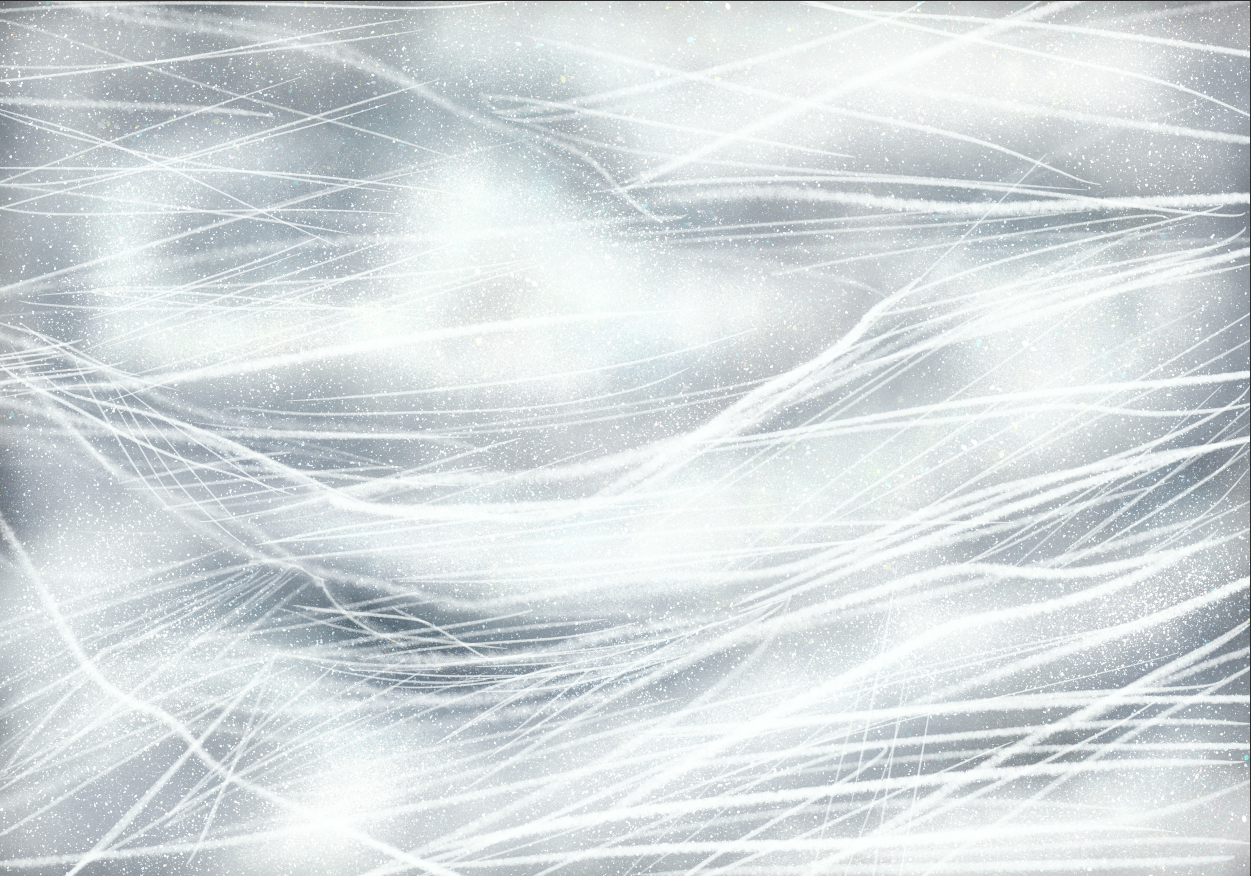
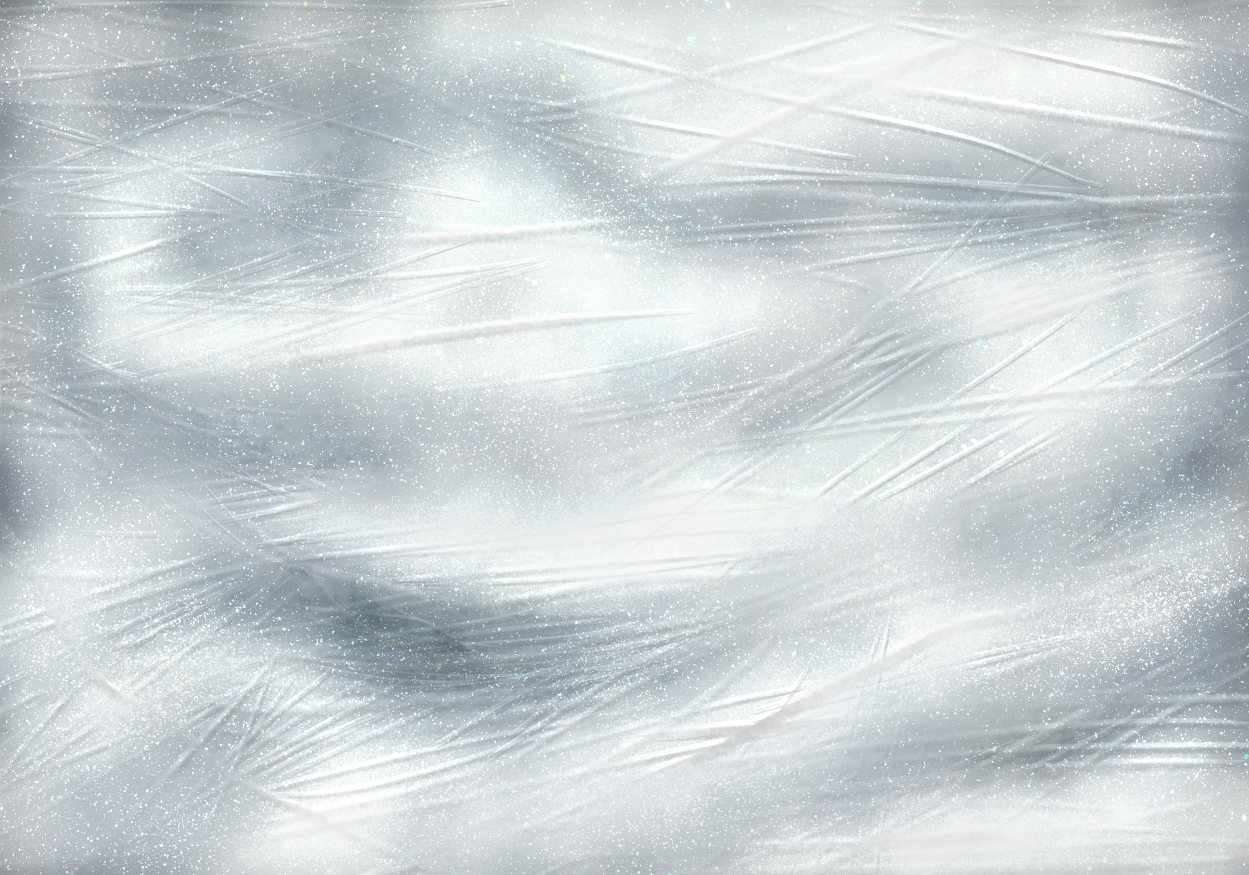
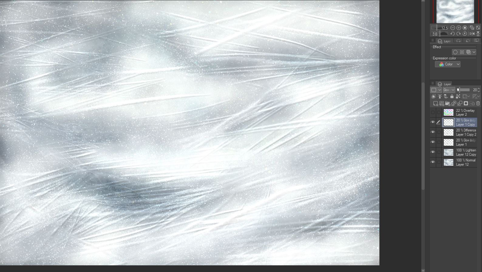
5. Just to play with it, I added more color. In the end, it didn't satisfy me, but, at least the whole point stands.
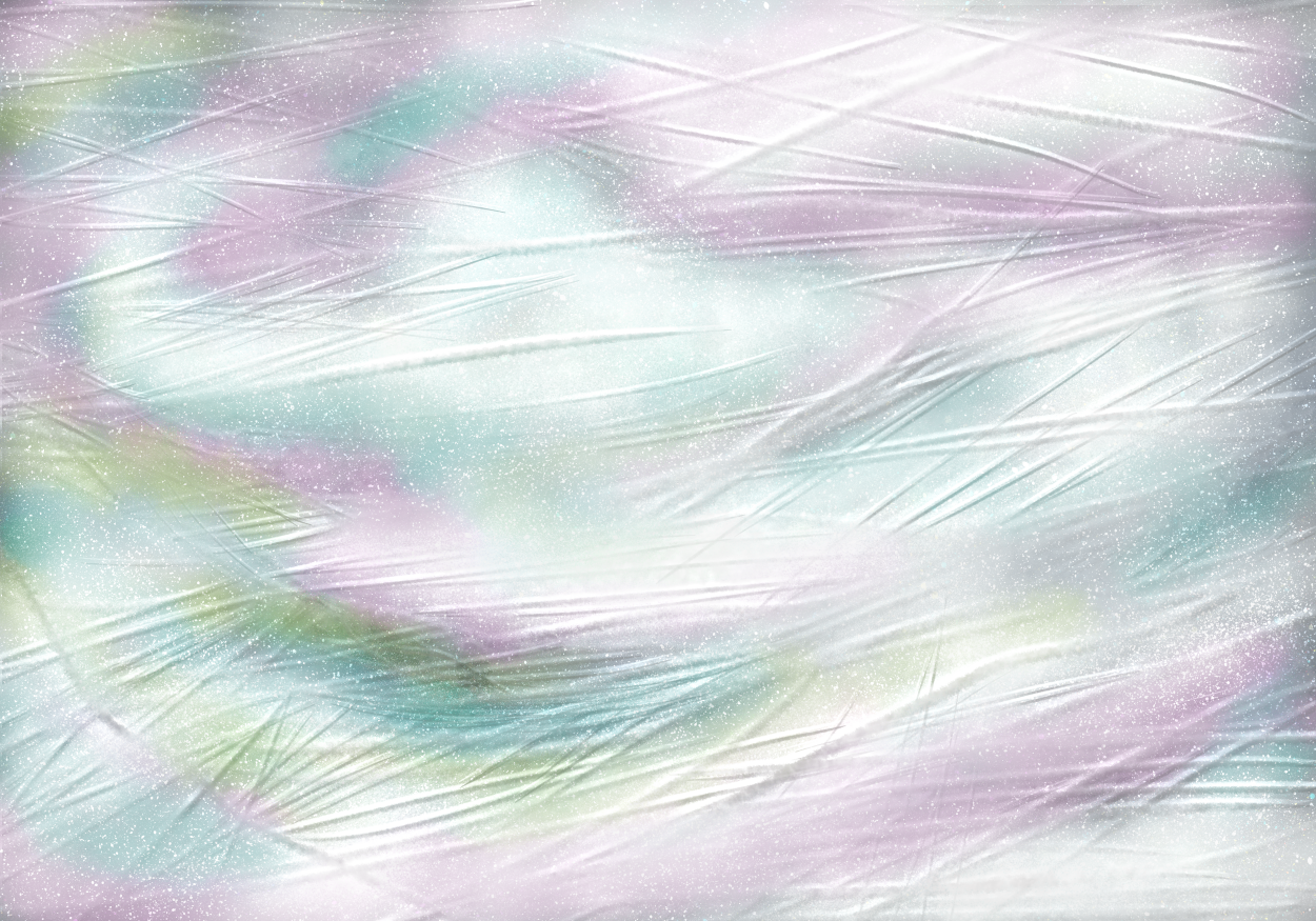
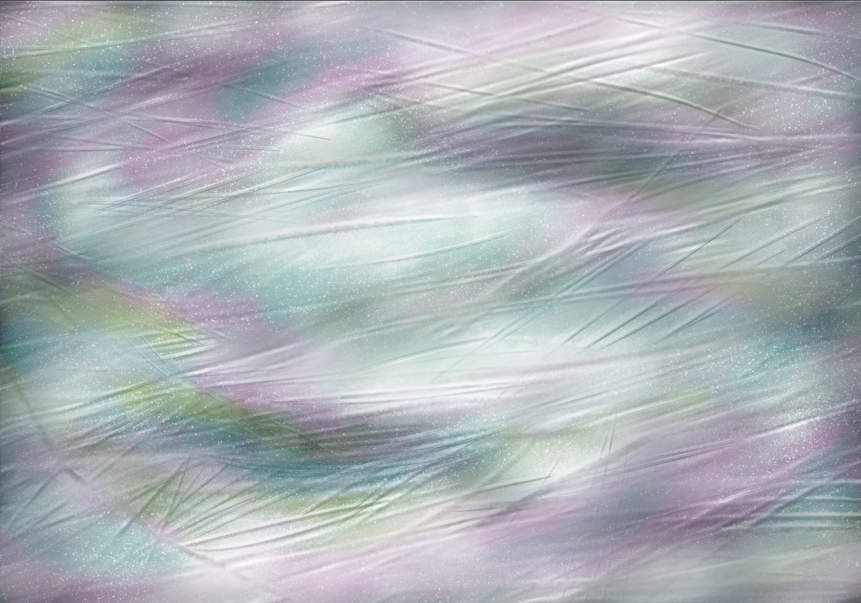
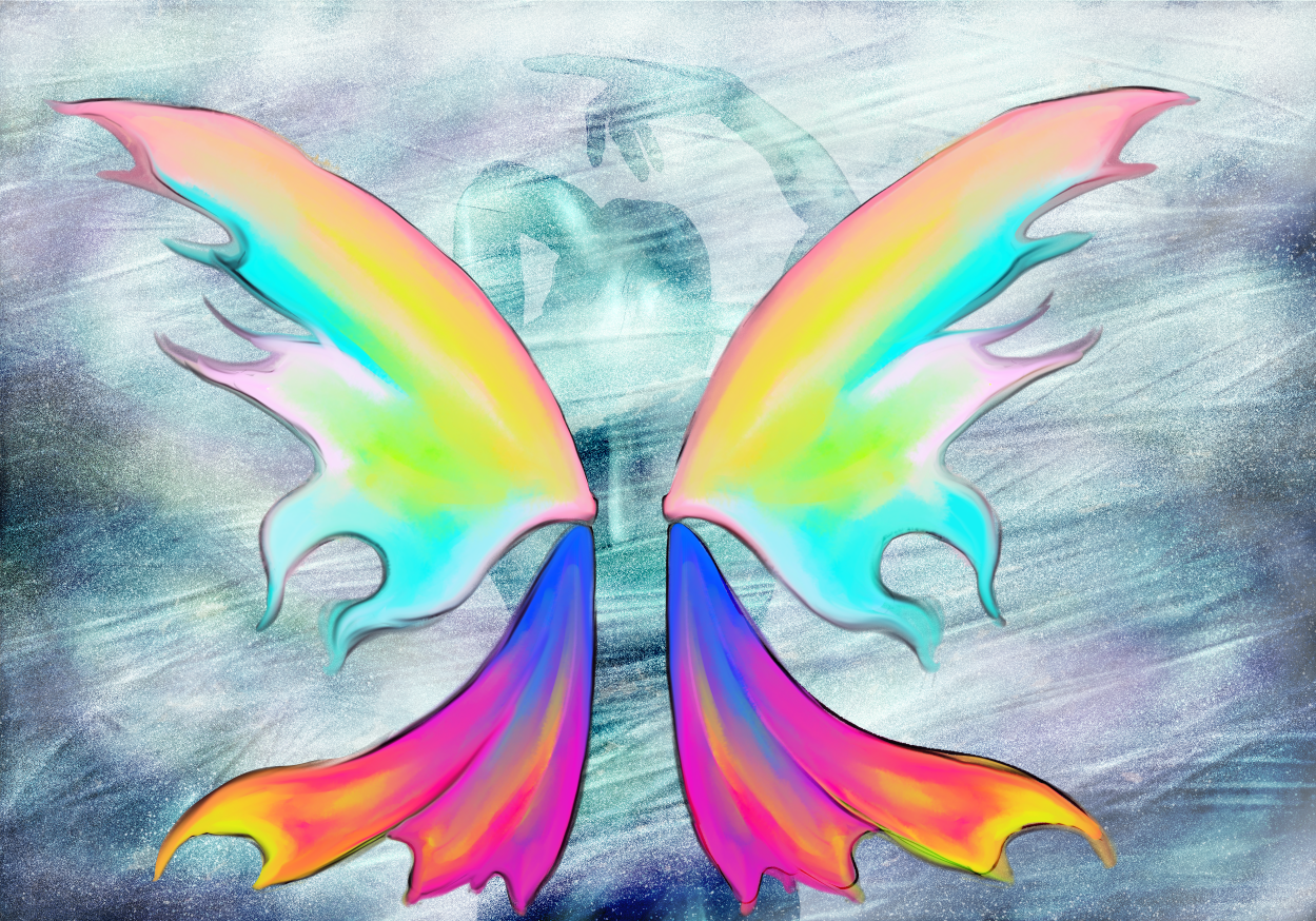
WHEN IS IT TOO MUCH?
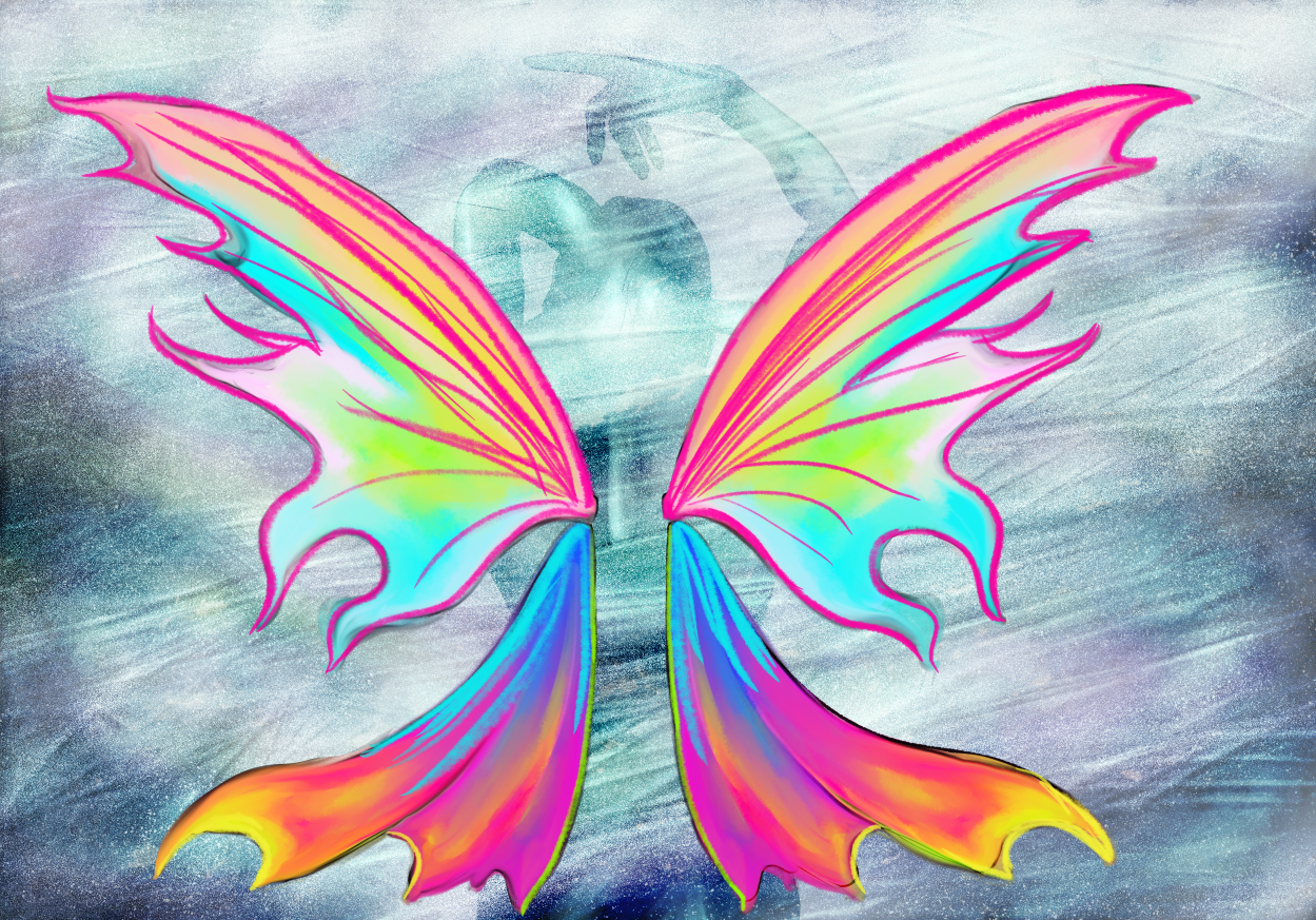
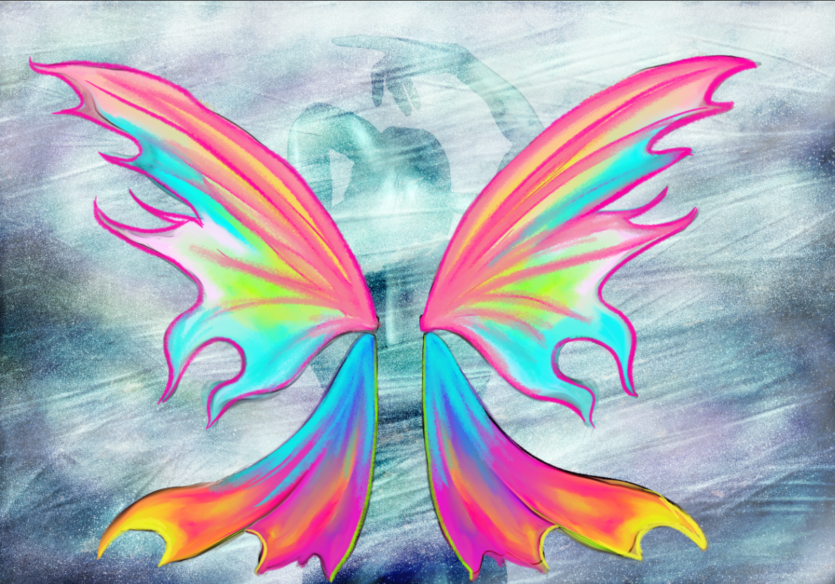
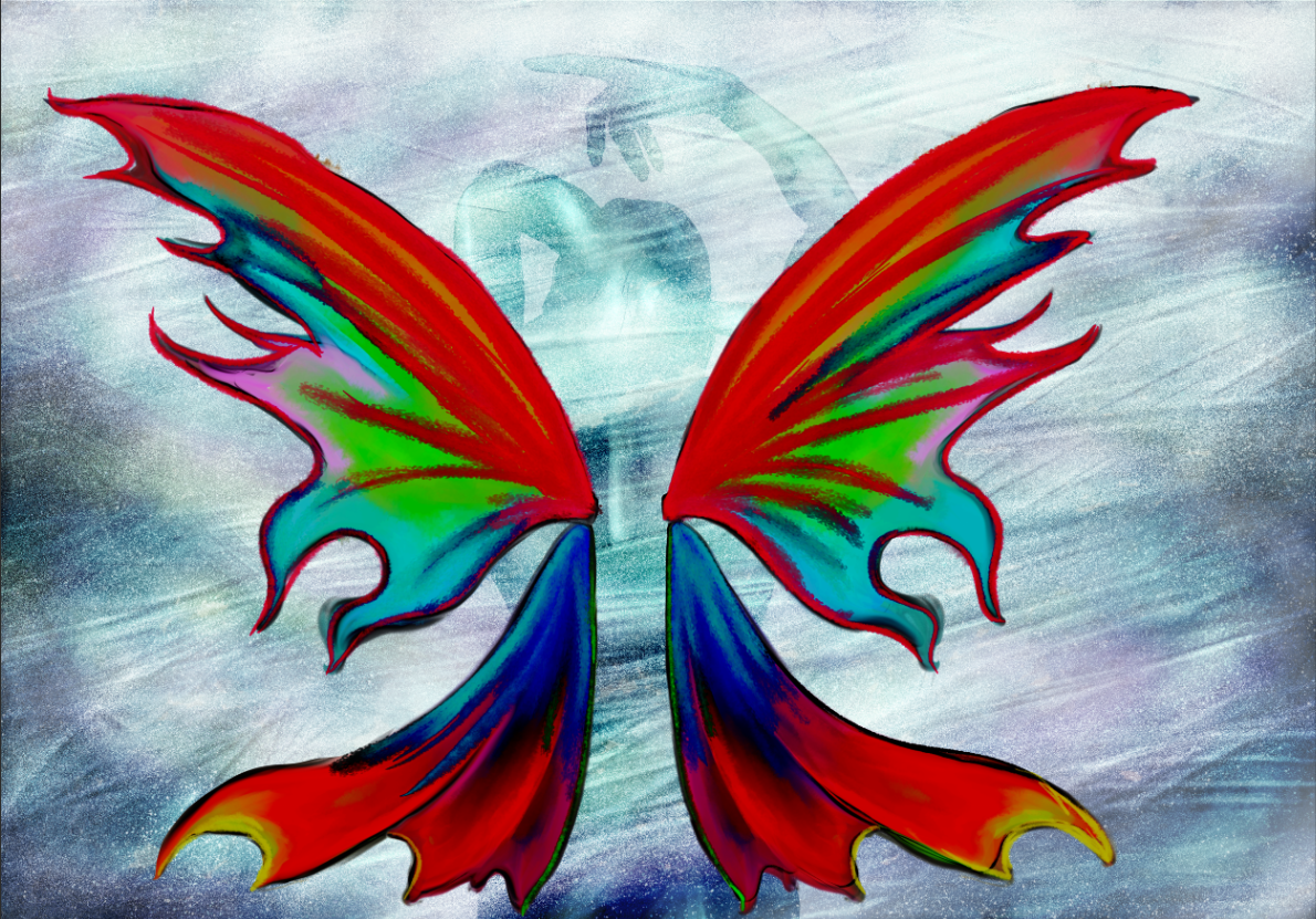
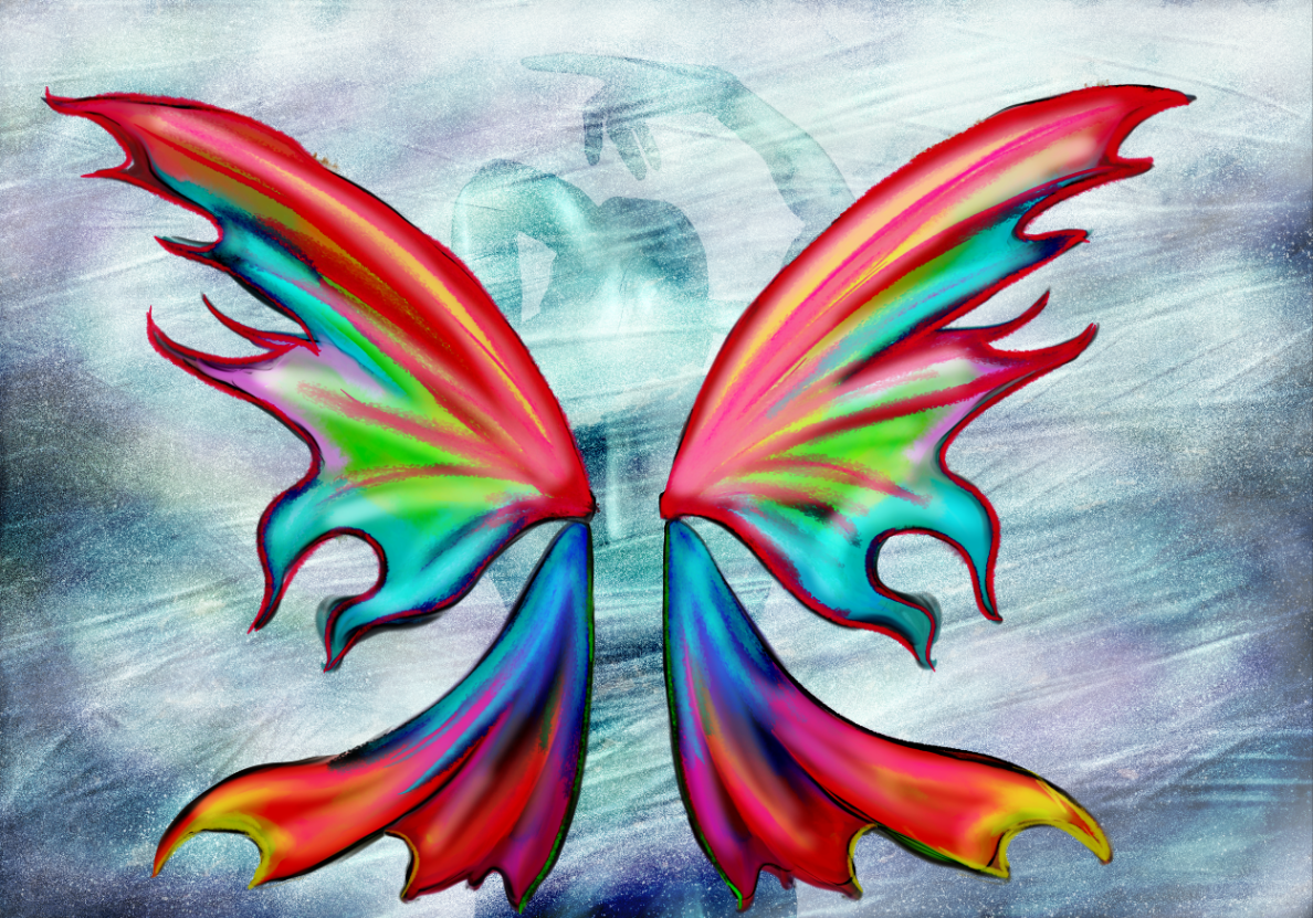
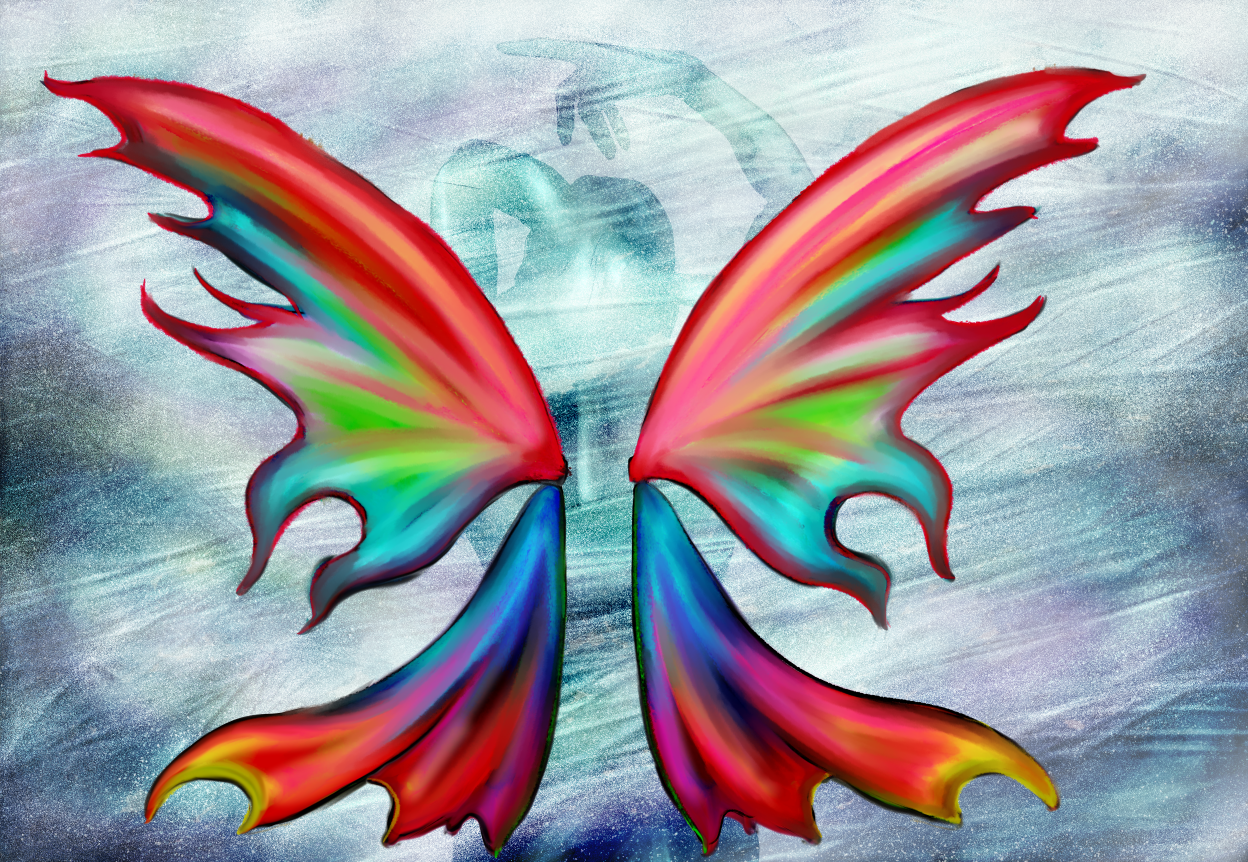
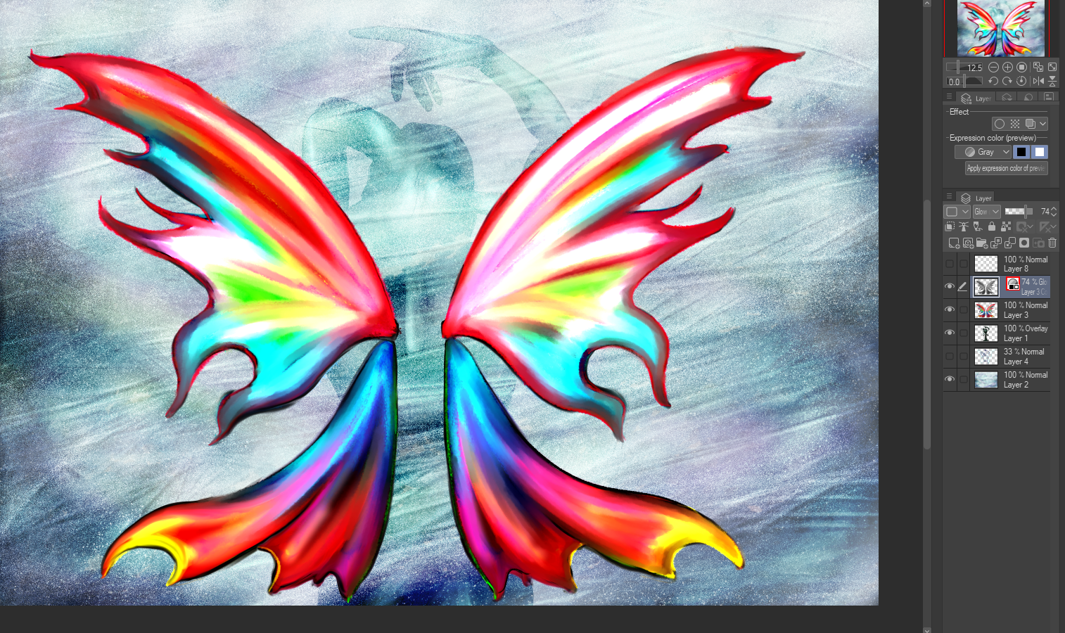
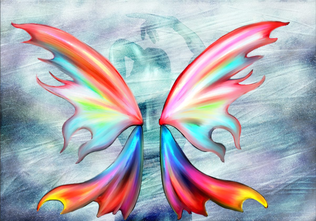
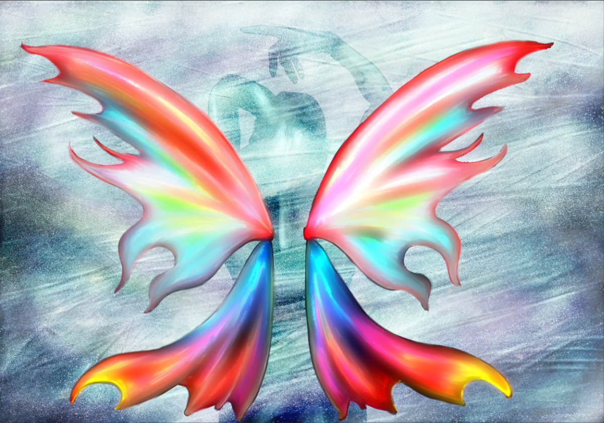
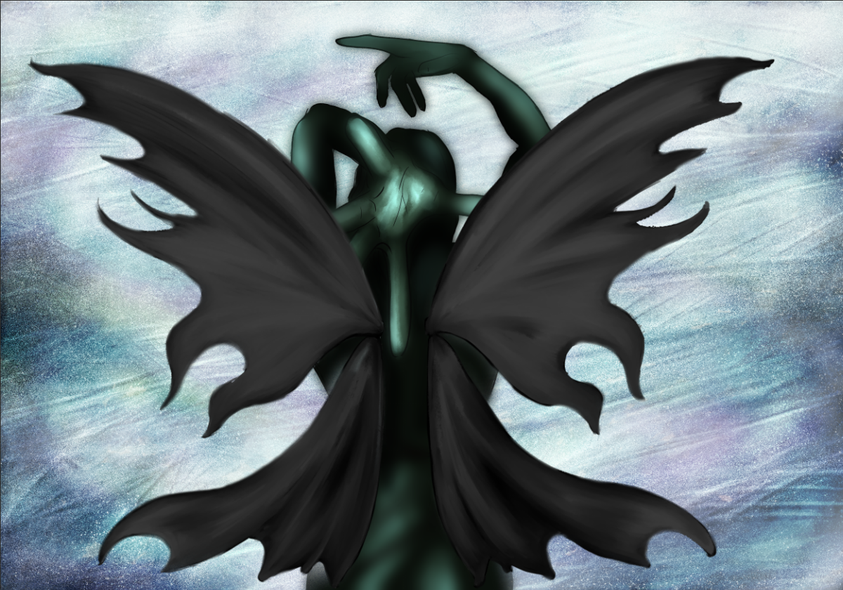
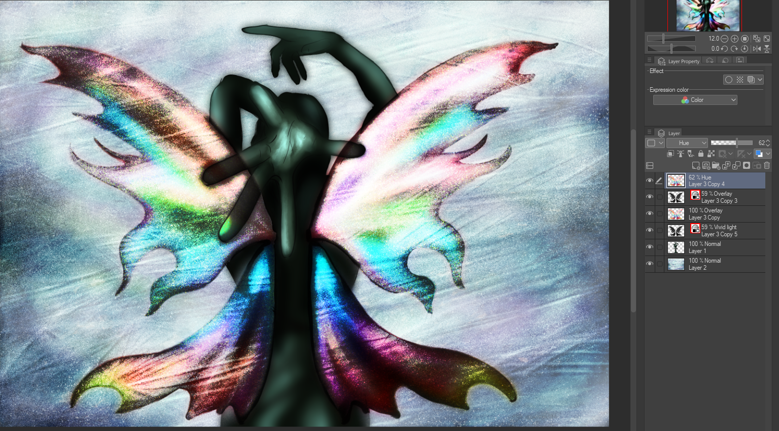
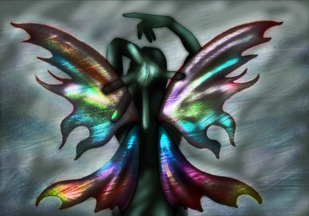
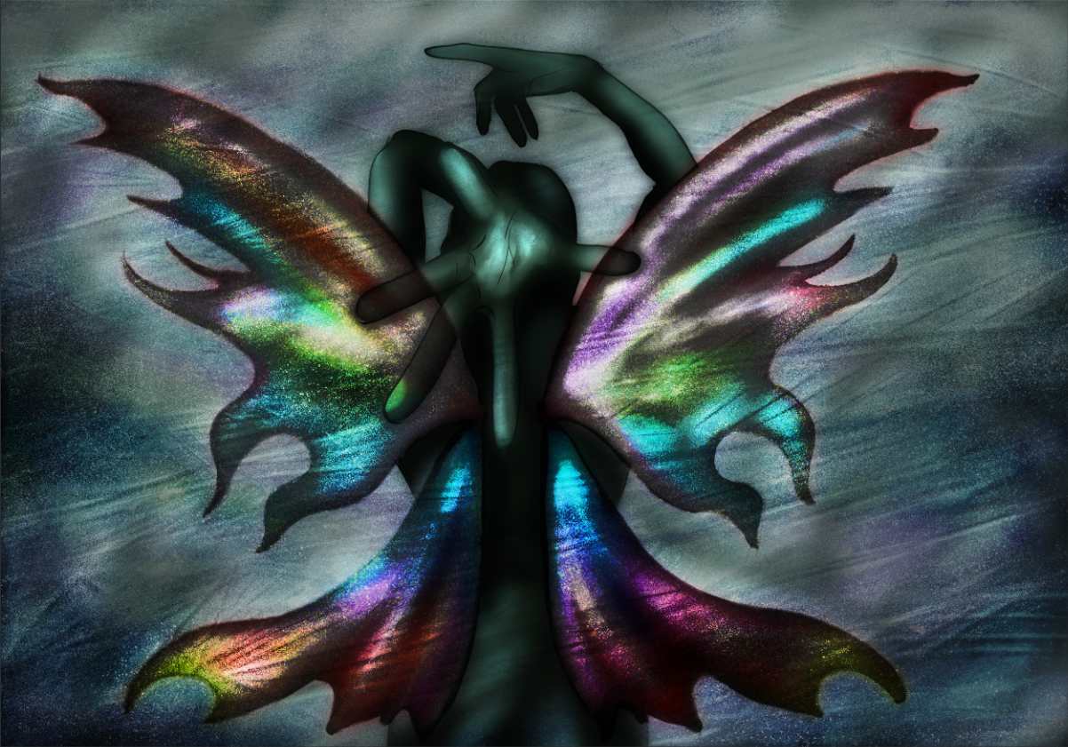
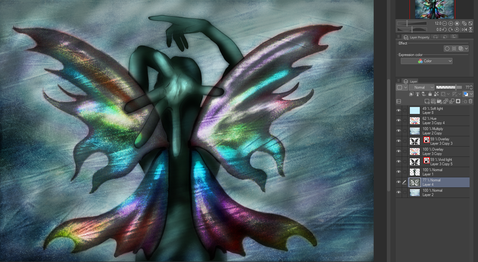
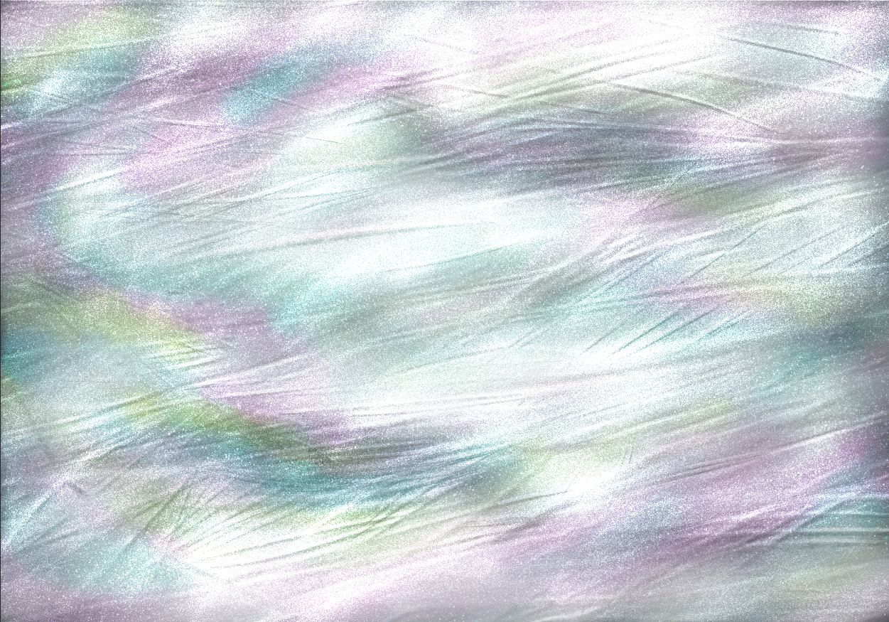
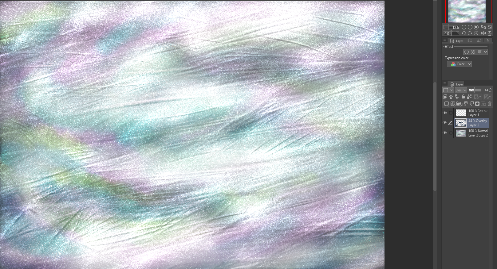
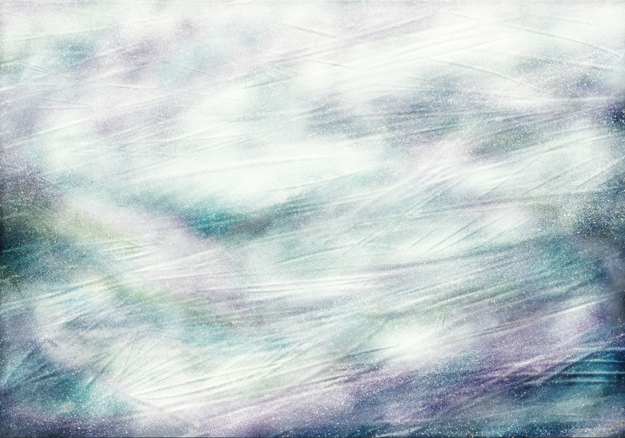
Can you figure it out, through these images?